
使用 linear() 函数在 CSS 动画中创建自定义缓动效果
 Michelle Barker
阅读时间 10 分钟
Michelle Barker
阅读时间 10 分钟
动画不仅仅是将事物从一个地方移动到另一个地方。事物移动(或以某种方式改变)的方式与传达目的感同等重要。在动画界,一个对象在一段时间内从一种状态过渡到另一种状态的方式被称为缓动。
在这篇文章中,我们将比较 CSS 中不同的缓动函数。CSS 中的 linear() 函数是一个新的缓动函数,它让我们能够更精细地控制动画的制作。我们将探讨 linear() 函数的工作原理,并看一些实际的应用示例。
CSS 中的缓动
正确选择缓动方式对于使动画看起来自然逼真至关重要。想象一下在地板上滚动一个球。它不会一直以相同的速度移动:它可能会迅速加速到最大速度,然后逐渐减慢速度并停止(这称为cubic-bezier 缓动)。将其与一个在整个动画时间线上以相同速度移动的球进行比较(这称为linear 缓动)。这感觉不太自然,不是吗?
控制 CSS 动画中的缓动
在 CSS 中,我们使用 animation-timing-function 属性为元素的动画应用缓动。
.box {
  animation-name: move;
  animation-duration: 2000ms;
  animation-timing-function: ease-in;
}
让我们回顾一下一些已有的 CSS 缓动技术。如果您已经熟悉这些,可以安全地跳过本节,直接阅读关于使用 linear() 函数应用自定义缓动 的部分。
缓动关键字
在 CSS 中制作动画时,我们可以从一些关键字中进行选择:ease-in、ease-out、ease-in-out、ease(默认)和 linear。它们也可以通过简写属性 animation 来应用。
.box {
  animation: move 2000ms ease-in;
}
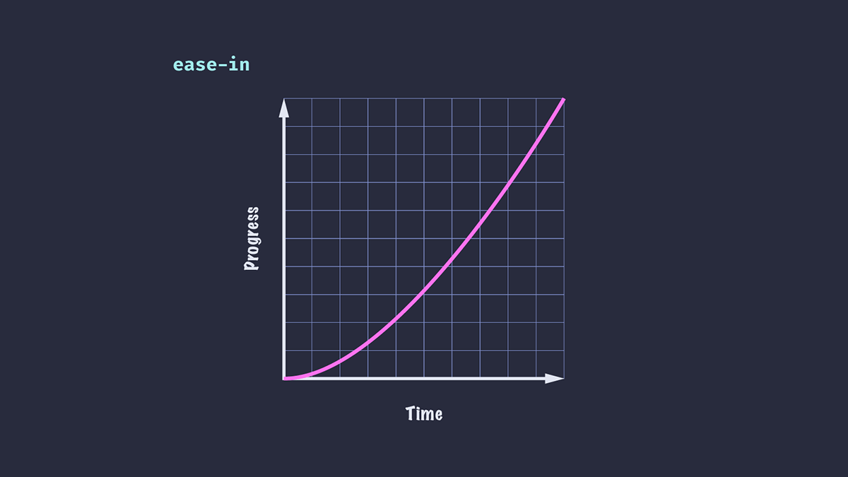
Ease-in (慢速开始)
动画开始缓慢,然后加速,最终达到最大速度。例如,汽车启动。
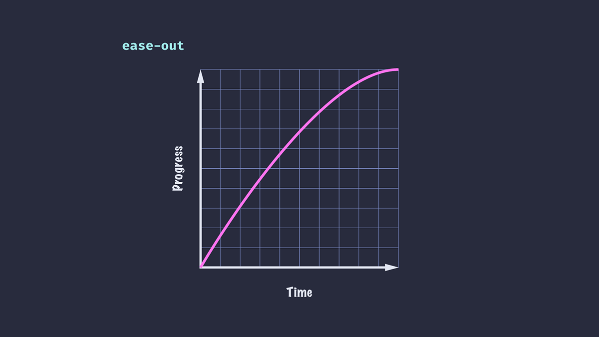
Ease-out (慢速结束)
动画开始快速,然后在一段时间内减慢速度——有点像在地板上滚动的球。这里的区别在于 ease-out 没有显示初始加速。
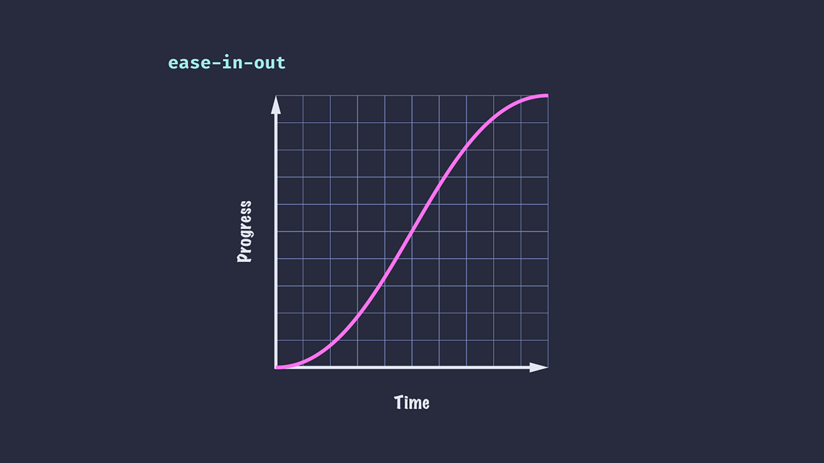
Ease-in-out (慢速开始,慢速结束)
动画同时使用上述两种原理:开始时逐渐加速,然后到结尾时逐渐减速。
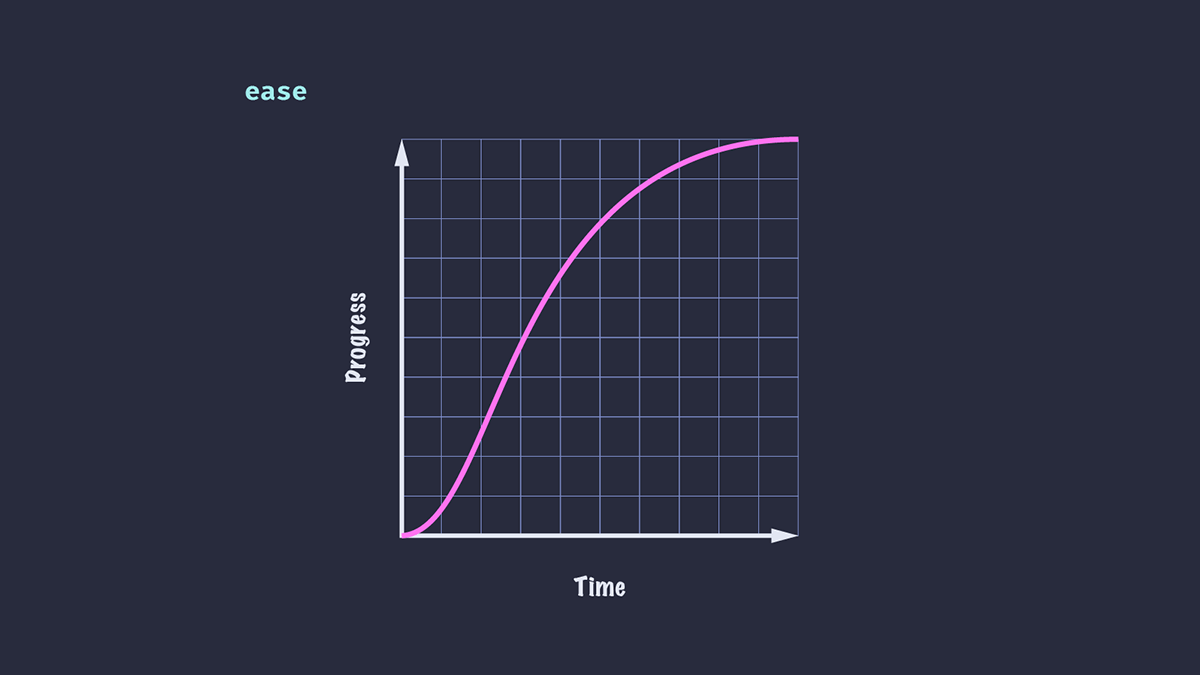
Ease (默认)
这是默认值。与 ease-in-out 类似,它既有加速也有减速,但它们不是均匀的。在这种情况下,动画有时看起来比 ease-in-out 更自然。
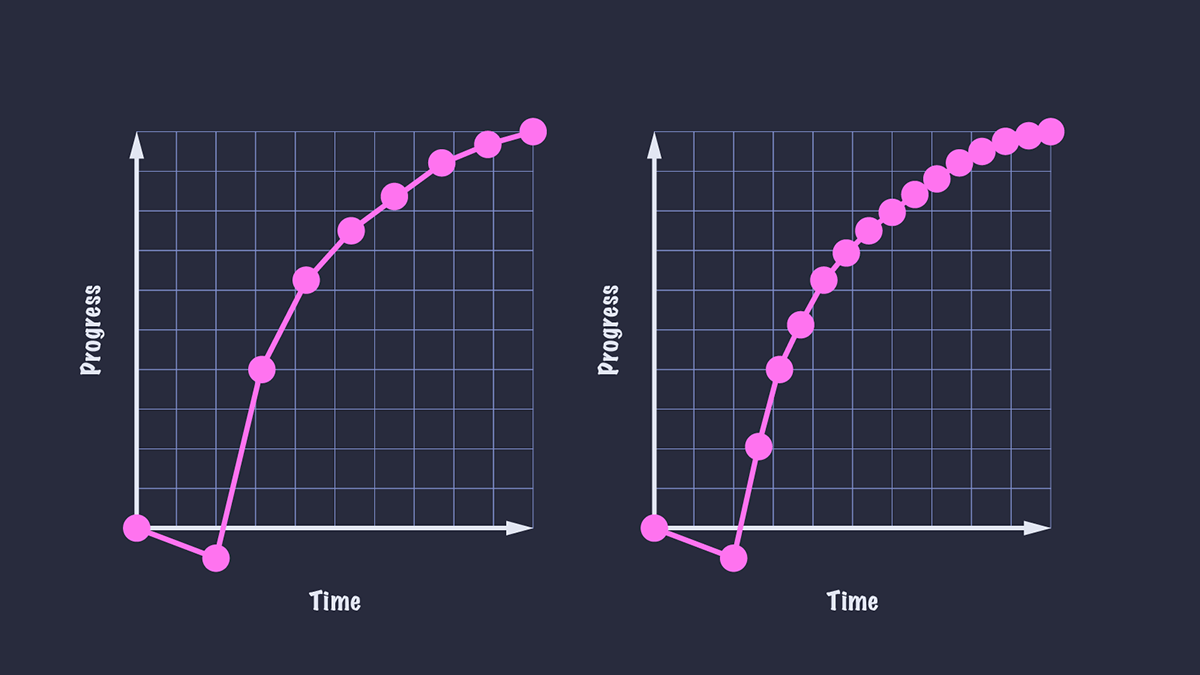
下面是两种关键字效果的并排比较。
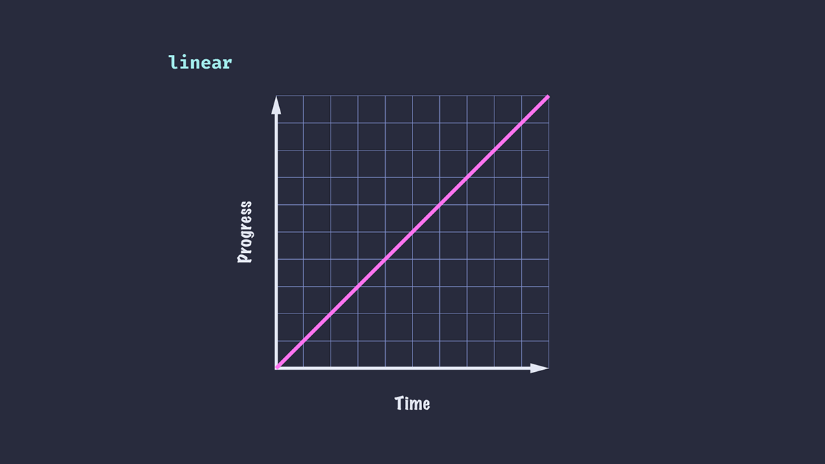
Linear (线性)
在整个动画过程中速度没有变化。虽然总体上不太逼真,但线性缓动在 UI 动画中很有用,例如滚动的 logo 或图片列表。
缓动函数
缓动关键字对于简单的 UI 元素(例如,应用于按钮的悬停状态)很有用,但对于更复杂的动画或我们想要更精细地控制速度的情况,它们并不总是足够。CSS 为我们提供了一些函数来创建自定义缓动:steps() 和 cubic-bezier()。
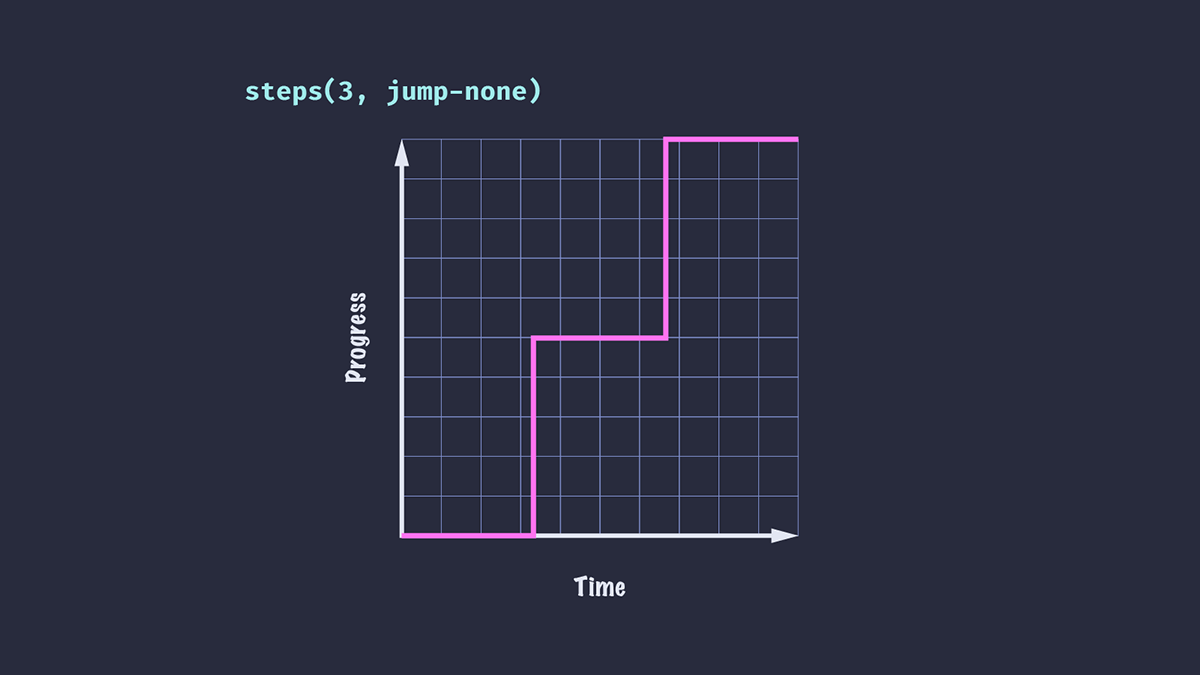
Steps (分步)
steps() 函数将输入时间划分为指定的间隔数——因此我们的动画将在一个值跳到下一个值。我们可以通过指定步数和跳转位置(可选)来完成。本文不打算深入探讨 steps() 缓动,但我建议阅读关于Steps 缓动函数 的内容,以了解不同值的效果。
.box {
  animation-timing-function: steps(3, jump-none);
}
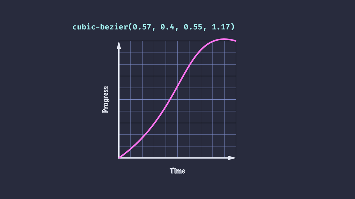
Cubic-bezier (三次贝塞尔)
cubic-bezier() 函数让我们能够更精细地控制 CSS 动画中的缓动。该函数接受四个值,它们对应于三次贝塞尔曲线的两个控制点。
我们可以使用 cubic-bezier() 创建更逼真的效果,例如让元素稍微超过其最终位置,然后再静止下来。
.ball {
  animation-timing-function: cubic-bezier(0.57, 0.4, 0.55, 1.17);
}
如果您理解其背后的数学原理,就可以非常有创意地定义自己的自定义曲线,例如 Temani Afif 在这篇《使用 cubic-bezier() 进行高级 CSS 动画》文章中展示的那样!
幸运的是,我们不必成为数学天才也能使用 cubic-bezier() 创建令人愉悦的缓动效果:Lea Verou 的Cubic Bezier 工具允许我们调整和可视化自定义缓动曲线并导出结果。
cubic-bezier 缓动函数的局限性
尽管 cubic-bezier() 非常通用,但它也有其局限性,因为我们只能控制三次贝塞尔曲线的两个点。
假设我们想让元素从左向右滑动,然后以递减的距离和速度弹跳几次,直到停止。如果我们查看easings.net,可以看到一系列缓动曲线,它们可能适合我们不同场景的需求(或可以进行调整以适应)。不幸的是,使用 cubic-bezier() 无法重现所有这些。
使用关键帧应用自定义缓动
实现自定义缓动的一种方法是使用关键帧动画。我们可以为元素的精确位置定义一系列关键帧,并应用整体线性缓动(因为我们的缓动实际上是由关键帧决定的)。
@keyframes easeOutElastic {
  0% { transform: translateX(0%); }
  16% { transform: translateX(-132.27%); }
  28% { transform: translateX(-86.88%); }
  44% { transform: translateX(-104.63%); }
  59% { transform: translateX(-98.36%); }
  73% { transform: translateX(-100.58%); }
  88% { transform: translateX(-99.8%); }
  100% { transform: translateX(-100%); }
}
注意:这个关键帧示例是摘自easings.net 的 "easeOutElastic" 示例。
这感觉有些笨拙,并且不易于调整以满足我们的需求。还有另一个问题:我们的动画只能朝一个方向播放。如果想从右到左应用相同的动画,我们需要创建另一组关键帧。
介绍 linear 定时函数
与其通过关键帧将缓动构建到动画中,不如使用新的 CSS linear() 函数来创建完全自定义的效果。
linear() 函数(不要与上面介绍的 linear 关键字混淆)需要一个逗号分隔的停止点列表,其值范围从 0 到 1。这些停止点在时间线上均匀分布。值为 linear(0, 1) 等同于 linear 关键字,动画进度速率在整个持续时间内没有变化。
传递三个停止点,值为 0、0.75 和 1,意味着在时间周期的 50% 时,动画将完成其进度的 75%。
.box {
  animation-timing-function: linear(0, 0.75, 1);
}
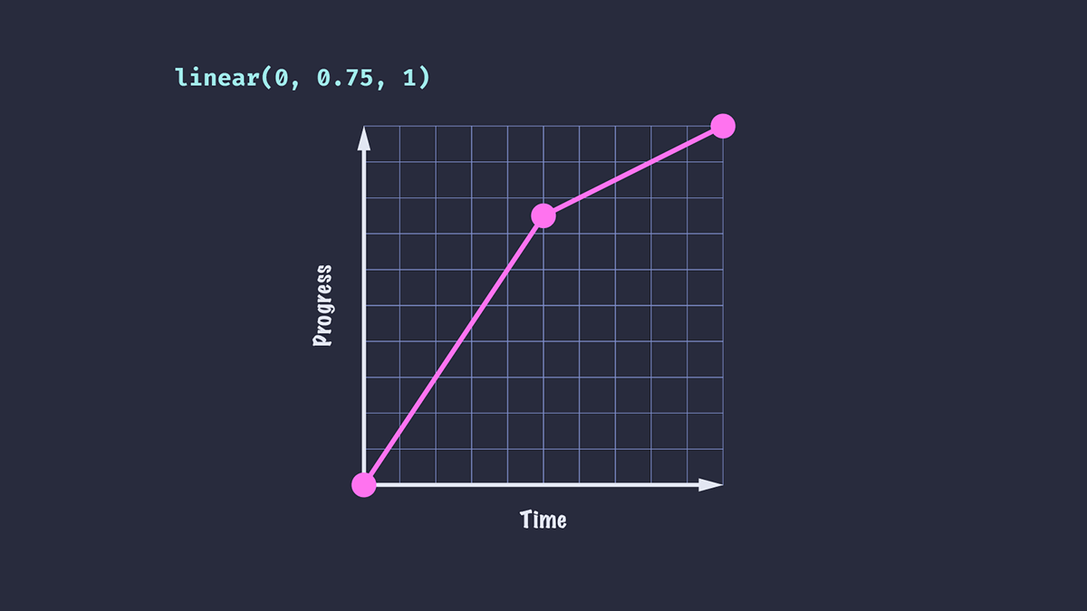
将此缓动应用于 translate 动画的结果是,元素在动画持续时间的前半段看起来比后半段移动得更快。
或者,让我们尝试给缓动函数传递一个负值。
.box {
  animation-timing-function: linear(0, -0.1, 0.75, 1);
}
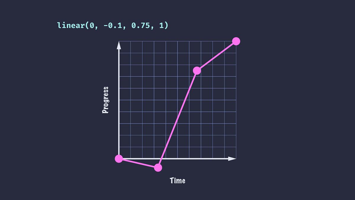
我们看到动画元素向后移动了一小段距离,然后才被推向终点。从 0 到 -0.1 所花费的时间与从 -0.1 到 0.75 所花费的时间相同。
我们还添加了一个额外的停止点,这意味着到达每个停止点所需的时间比第一个示例要短:在持续时间为 1 秒的动画中,每个停止点需要 1/3 秒,而不是第一个示例的 0.5 秒。
起始和结束停止点
我们的停止点列表不必从 0 到 1。我们可以从时间线的稍晚位置开始动画,动画将从该位置开始播放,持续时间相同。在这里,您可以看到第二和第三个框花费相同的时间来移动第一个框一半的距离,从其时间线的不同位置开始和结束。
.box {
  animation: slide 3000ms linear(0, 1);
}

.box:nth-child(2) {
  animation-timing-function: linear(0.5, 1);
}

.box:nth-child(3) {
  animation-timing-function: linear(0, 0.5);
}
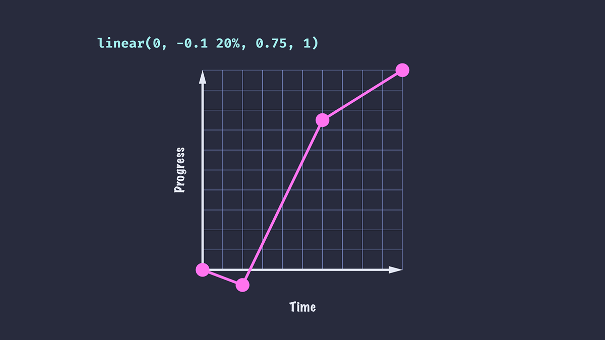
停止点时长
我们可以通过额外传递停止点时长来控制动画持续时间内的停止点位置。如果我们希望元素在 33.33%(当有四个停止点时)而不是 20% 的持续时间内达到第二个停止点值,我们可以在 linear() 函数中指定该值。
.box {
  animation-timing-function: linear(0, -0.1 20%, 0.75, 1);
}
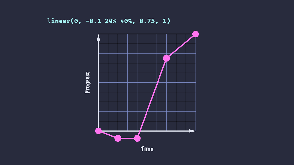
我们还可以为停止点设置一个可选的结束值。
.box {
  animation-timing-function: linear(0, -0.1 20% 40%, 0.75, 1);
}
我们的动画将在持续时间的 20% 时达到第二个停止点值,暂停到 40%,然后进行到结束。
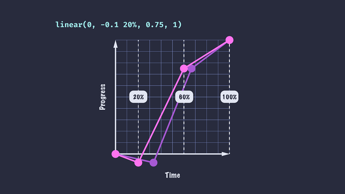
缓动曲线现在看起来像这样。
您可能会注意到,一旦我们添加了停止点时长,剩余的停止点就会均匀分布在剩余的持续时间内。对于值 linear(0, -0.1 20%, 0.75, 1),停止点 0.75 不再出现在持续时间的 2/3 处,而是位于 60%;这是因为持续时间的最后 80% 在最后三个停止点之间均匀分布。
使用 linear 缓动函数创建平滑曲线
我们的动画缓动看起来仍然相当线性。现在还不能说这是“逼真”的动画!在第一个示例中,元素快速移动到 0.75 的位置,然后突然切换到较慢的速度。如果我们想创建更平滑的减速,我们需要添加更多的停止点。
animation-timing-function: linear(0, -0.1 20%, 0.4, 0.63, 0.75, 0.84, 0.92, 0.97, 1);
现在元素的减速不是完全平滑的,但对于快速动画来说可能已经足够平滑了。如果我们的动画持续时间更长,值的变化可能会更明显。
通常来说,我们使用的停止点越多,动画就越平滑,因为停止点之间的变化将难以察觉。
使用 JavaScript 重现流行的缓动效果
当然,手动创建所有这些停止点可能会很麻烦!如果我们知道创建缓动曲线所需的函数,就可以使用 JavaScript 来创建具有大量点的平滑曲线。
此示例中的 easeOutBounce 函数改编自 easings.net。我们可以将这些缓动效果设置为自定义属性,以便在我们的代码中使用。
const easeOutBounce = (x) => {
  const n1 = 7.5625;
  const d1 = 2.75;

  if (x < 1 / d1) {
    return n1 * x * x;
  } else if (x < 2 / d1) {
    return n1 * (x -= 1.5 / d1) * x + 0.75;
  } else if (x < 2.5 / d1) {
    return n1 * (x -= 2.25 / d1) * x + 0.9375;
  } else {
    return n1 * (x -= 2.625 / d1) * x + 0.984375;
  }
};

const createEase = (fn, points = 50) => {
  const result = [...new Array(points)]
    .map((d, i) => {
      const x = i * (1 / points);
      return fn(x);
    })
    .join(",");

  return `linear(${result})`;
};

document.body.style.setProperty("--easeOutBounce", createEase(easeOutBounce));
.bounce {
  animation-timing-function: var(--easeOutBounce);
}
将 linear 缓动函数与 SVG 路径结合使用
如果我们能直接给 linear() 函数一个 SVG 路径值,那不是很好吗?虽然我们不能直接这样做,但有一个工具可以帮助我们。Linear() generator 可将 SVG 路径转换为 linear() 函数的停止点,并允许我们预览结果。是不是很有用!
该工具还允许我们可视化 JavaScript 函数并将其输出为 CSS,因此我们可以从类似于上述函数的创建停止点,而无需发送任何客户端 JavaScript。“bounce”函数已在工具的预设中提供,从而生成以下 CSS。
:root {
  --bounce-easing: linear(0, 0.004, 0.016, 0.035, 0.063, 0.098, 0.141 13.6%, 0.25, 0.391, 0.563, 0.765, 1, 0.891 40.9%, 0.848, 0.813, 0.785, 0.766, 0.754, 0.75, 0.754, 0.766, 0.785, 0.813, 0.848, 0.891 68.2%, 1 72.7%, 0.973, 0.953, 0.941, 0.938, 0.941, 0.953, 0.973, 1, 0.988, 0.984, 0.988, 1);
}
浏览器支持
linear() 函数目前在 Safari 中不受支持。但是,如果我们将 animation-timing-function 用作独立属性,而不是使用简写属性,则可以轻松地回退到默认的 ease 关键字(或一些其他支持良好的动画)。不支持 linear() 函数的浏览器将回退到声明的值,因为浏览器会忽略它们不识别的任何属性/值对。
/* Using the shorthand, the animation will not be applied in browsers that do not support `linear()` */
.box {
  animation: slide 3000ms linear(0, 0.75, 1);
}

/* This way, non-supporting browsers will fall back to `ease-out` */
.box {
  animation: slide 3000ms ease-out;
  animation-timing-function: linear(0, 0.75, 1);
}
或者,我们可以使用特性查询来检测对 linear() 的支持,并提供替代方案。
/* Fallback animation. You could define an alternative animation with keyframes if you choose. */
.box {
  animation: alternativeSlide 3000ms;
}

/* Browsers that support `linear()` will get these styles */
@supports (animation-timing-function: linear(0, 1)) {
  .box {
    animation: slide 3000ms linear(0, 0.75, 1);
  }
}