animation-timing-function: linear;
animation-timing-function: ease-in-out;
animation-timing-function: steps(5, end);
animation-timing-function: cubic-bezier(0.1, -0.6, 0.2, 0);
<section class="flex-column" id="default-example">
  <div class="animating" id="example-element"></div>
  <button id="play-pause">Play</button>
</section>
#example-element {
  animation-duration: 3s;
  animation-iteration-count: infinite;
  animation-name: slide;
  animation-play-state: paused;
  background-color: #1766aa;
  border-radius: 50%;
  border: 5px solid #333333;
  color: white;
  height: 150px;
  margin: auto;
  margin-left: 0;
  width: 150px;
}

#example-element.running {
  animation-play-state: running;
}

#play-pause {
  font-size: 2rem;
}

@keyframes slide {
  from {
    background-color: orange;
    color: black;
    margin-left: 0;
  }
  to {
    background-color: orange;
    color: black;
    margin-left: 80%;
  }
}
const el = document.getElementById("example-element");
const button = document.getElementById("play-pause");

button.addEventListener("click", () => {
  if (el.classList.contains("running")) {
    el.classList.remove("running");
    button.textContent = "Play";
  } else {
    el.classList.add("running");
    button.textContent = "Pause";
  }
});
通常,为了图方便,可以使用简写属性 animation 一次性设置所有动画属性。
/* Keyword values */
animation-timing-function: ease;
animation-timing-function: ease-in;
animation-timing-function: ease-out;
animation-timing-function: ease-in-out;
animation-timing-function: linear;
animation-timing-function: step-start;
animation-timing-function: step-end;

/* cubic-bezier() function values */
animation-timing-function: cubic-bezier(0.42, 0, 1, 1); /* ease-in */
animation-timing-function: cubic-bezier(0, 0, 0.58, 1); /* ease-out */
animation-timing-function: cubic-bezier(0.42, 0, 0.58, 1); /* ease-in-out */

/* linear() function values */
animation-timing-function: linear(0, 0.25, 1);
animation-timing-function: linear(0 0%, 0.25 50%, 1 100%);
animation-timing-function: linear(0, 0.25 50% 75%, 1);
animation-timing-function: linear(0, 0.25 50%, 0.25 75%, 1);

/* steps() function values */
animation-timing-function: steps(4, jump-start);
animation-timing-function: steps(10, jump-end);
animation-timing-function: steps(20, jump-none);
animation-timing-function: steps(5, jump-both);
animation-timing-function: steps(6, start);
animation-timing-function: steps(8, end);

/* Multiple animations */
animation-timing-function: ease, step-start, cubic-bezier(0.1, 0.7, 1, 0.1);

/* Global values */
animation-timing-function: inherit;
animation-timing-function: initial;
animation-timing-function: revert;
animation-timing-function: revert-layer;
animation-timing-function: unset;
<easing-function>-
由 animation-name 决定的,与给定动画相对应的缓动函数。
非阶梯的关键字值(ease、linear、ease-in-out 等)各自代表一个固定的四点三次贝塞尔曲线,而 cubic-bezier() 函数值允许指定一个非预定义的值。steps() 缓动函数将输入时间划分为指定数量的等长时间间隔。其参数包括步数和步进位置。
linear-
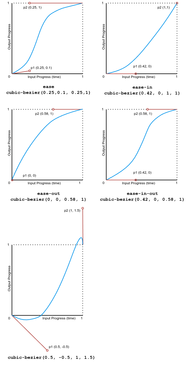
等同于 cubic-bezier(0.0, 0.0, 1.0, 1.0),动画以均匀的速度运行。
ease-
等同于 cubic-bezier(0.25, 0.1, 0.25, 1.0),为默认值,动画在中间部分加速,在末尾减速。
ease-in-
等同于 cubic-bezier(0.42, 0, 1.0, 1.0),动画开始时很慢,然后动画属性的过渡速度不断增加直到完成。
ease-out-
等同于 cubic-bezier(0, 0, 0.58, 1.0),动画开始时很快,然后随着动画的继续而减慢。
ease-in-out-
等同于 cubic-bezier(0.42, 0, 0.58, 1.0),动画属性的过渡开始和结束时都很慢,中间部分加速。
cubic-bezier(<number [0,1]> , <number> , <number [0,1]> , <number>)-
一个由作者定义的三次贝塞尔曲线,其中第一个和第三个值必须在 0 到 1 的范围内。
linear(<number> <percentage>{1,2}, …)-
该函数在提供的缓动停止点之间进行线性插值。一个停止点是一对输出进度和输入百分比。输入百分比是可选的,如果未指定,则会推断。如果未提供输入百分比,则第一个和最后一个停止点分别设置为 0% 和 100%,中间的停止点则通过在具有百分比值的最近的前后点之间进行线性插值得到百分比值。
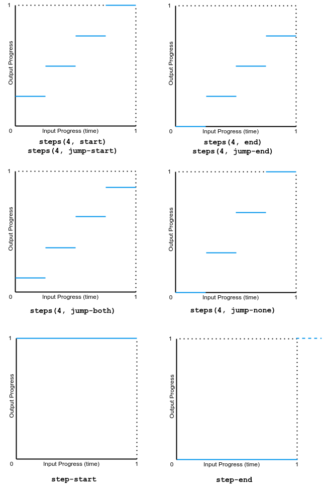
steps(<integer>, <step-position>)-
沿着过渡过程显示一个包含 n 个停顿点的动画迭代,每个停顿点显示相同的时间长度。例如,如果 n 为 5,则有 5 个步骤。动画是在 0%、20%、40%、60% 和 80% 处短暂保持,还是在 20%、40%、60%、80% 和 100% 处短暂保持,或是在 0% 和 100% 之间创建 5 个停顿点,或是在 0%、25%、50%、75% 和 100% 处创建 5 个停顿点(包括 0% 和 100% 标记),这取决于使用以下哪种步进位置。
jump-start-
表示一个左连续函数,因此第一次跳跃发生在动画开始时。
jump-end-
表示一个右连续函数,因此最后一次跳跃发生在动画结束时。这是默认值。
jump-none-
两端都没有跳跃,在插值迭代期间有效地移除了一个步骤。相反,它在 0% 标记和 100% 标记处都保持,每个标记保持 1/n 的时长。
jump-both-
在 0% 和 100% 标记处都包含暂停,在动画迭代期间有效地增加了一个步骤。
start-
与 jump-start 相同。
end-
与 jump-end 相同。
step-start-
等同于 steps(1, jump-start)
step-end-
等同于 steps(1, jump-end)
备注: 在创建 CSS 滚动驱动动画时,animation-timing-function 的效果与常规的基于时间的动画相同。
缓动函数可以在 @keyframes 规则中的单个关键帧上指定。如果关键帧上没有指定 animation-timing-function,则使用应用动画的元素上对应的 animation-timing-function 值作为该关键帧的值。
在关键帧内,animation-timing-function 是一个 at-rule-specific 描述符,而不是同名的属性。时间节奏本身不会被动画化。相反,一个关键帧的缓动函数会逐个属性地应用,从指定它的关键帧开始,直到下一个指定该属性的关键帧,或者如果没有后续关键帧指定该属性,则直到动画结束。因此,在 100% 或 to 关键帧上指定的 animation-timing-function 永远不会被使用。
animation-timing-function =
  <easing-function>#

<easing-function> =
  <linear-easing-function>        |
  <cubic-bezier-easing-function>  |
  <step-easing-function>

<linear-easing-function> =
  linear      |
  <linear()>

<cubic-bezier-easing-function> =
  ease              |
  ease-in           |
  ease-out          |
  ease-in-out       |
  <cubic-bezier()>

<step-easing-function> =
  step-start  |
  step-end    |
  <steps()>

<linear()> =
  linear( [ <number> && <percentage>{0,2} ]# )

<cubic-bezier()> =
  cubic-bezier( [ <number [0,1]> , <number> ]#{2} )

<steps()> =
  steps( <integer> , <step-position>? )

<step-position> =
  jump-start  |
  jump-end    |
  jump-none   |
  jump-both   |
  start       |
  end
本节中的所有示例都使用不同的 animation-timing-function 值对几个 <div> 元素的 width 和 background-color 属性进行动画处理。宽度从 0 动画到 100%,背景颜色从石灰色动画到品红色。
该示例演示了各种 linear() 缓动函数值的效果。
<div class="parent">
  <div class="linear">'linear' value</div>
  <div class="linear-fn1">linear(0, 0.5 50%, 1)</div>
  <div class="linear-fn2">linear(0, 0.25 75%, 1)</div>
  <div class="linear-fn3">linear(0, 0.75 25%, 1)</div>
  <div class="linear-fn4">linear(0, 0.5 25% 75%, 1)</div>
  <div class="linear-fn5">linear(0, 0.25 45%, 0.75 55%, 0.5 70%, 1)</div>
  <div class="linear-fn6">linear(0, 1.2 50%, 0.75 80%, 1)</div>
  <div class="linear-fn7">linear(0, 0.5 75%, 1 120%)</div>
</div>
<div class="x-axis"><span>25%</span><span>50%</span><span>75%</span></div>
<button>Play animation</button>
const btn = document.querySelector("button");
const divs = document.querySelectorAll(".parent > div[class]");

btn.addEventListener("click", () => {
  btn.setAttribute("disabled", "true");
  for (const div of divs) {
    div.classList.remove("animate");
    void div.offsetWidth;
    div.classList.add("animate");
  }
  setTimeout(() => {
    btn.removeAttribute("disabled");
  }, 11000);
});
.x-axis {
  display: flex;
  justify-content: space-evenly;
  width: 80vw;
  margin-left: 4px;
}

.parent {
  background: linear-gradient(
    to right,
    white 24.8%,
    grey 24.8%,
    grey 25.2%,
    white 25.2%,
    white 49.8%,
    grey 49.8%,
    grey 50.2%,
    white 50.2%,
    white 74.8%,
    grey 74.8%,
    grey 75.2%,
    white 75.2%
  );
  width: 80vw;
  font-family: monospace;
  font-weight: bold;
  border: 2px solid grey;
}

.animate {
  animation-name: changeme;
}

.parent > div[class] {
  animation-fill-mode: forwards;
  animation-duration: 10s;

  width: 0;
  margin-bottom: 4px;
  padding: 5px 0;
  box-sizing: border-box;
  text-wrap: nowrap;
  background-color: lime;
}

@keyframes changeme {
  0% {
    width: 0em;
  }
  100% {
    width: 100%;
    background-color: orange;
  }
}

.linear {
  animation-timing-function: linear;
}
.linear-fn1 {
  animation-timing-function: linear(0, 0.5 50%, 1);
}
.linear-fn2 {
  animation-timing-function: linear(0, 0.25 75%, 1);
}
.linear-fn3 {
  animation-timing-function: linear(0, 0.75 25%, 1);
}
.linear-fn4 {
  animation-timing-function: linear(0, 0.5 25% 75%, 1);
}
.linear-fn5 {
  animation-timing-function: linear(0, 0.25 45%, 0.75 55%, 0.5 70%, 1);
}
.linear-fn6 {
  animation-timing-function: linear(0, 1.2 50%, 0.75 80%, 1);
}
.linear-fn7 {
  animation-timing-function: linear(0, 0.5 75%, 1 120%);
}
下图显示了本例中使用的所有 linear() 函数值的图表。输入进度(时间)绘制在 x 轴上,输出进度绘制在 y 轴上。根据语法,输入进度范围从 0 到 100%,输出范围从 0 到 1。
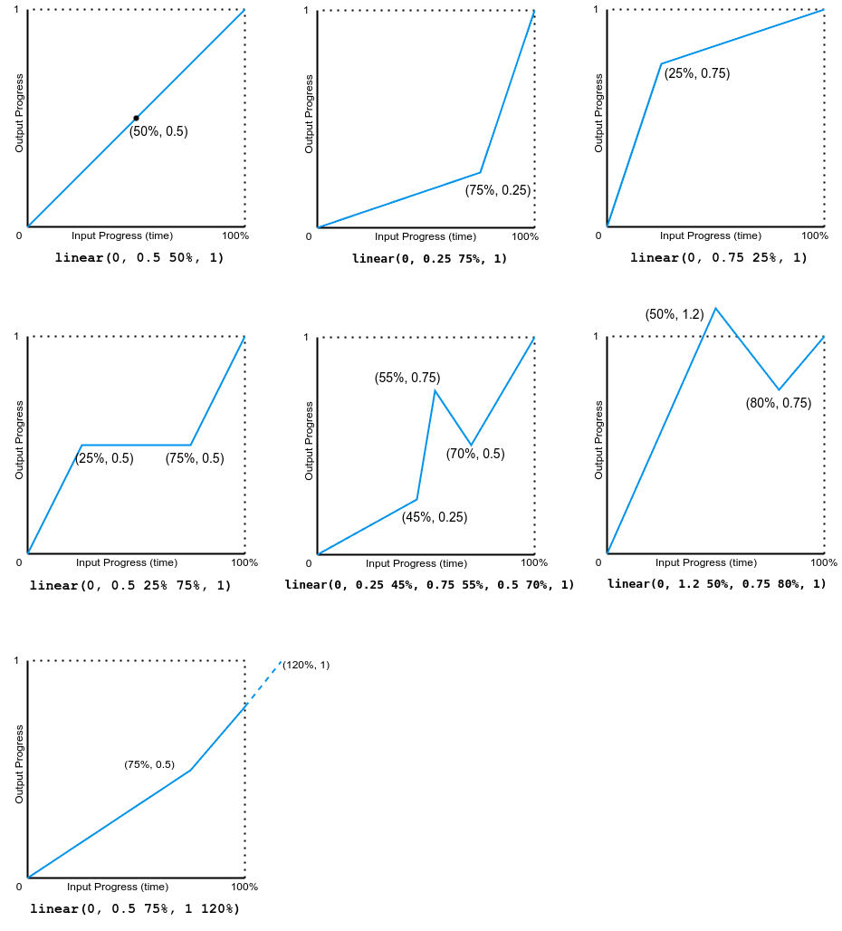
注意,输出可以前进或后退。
该示例演示了各种贝塞尔曲线缓动函数的效果。
<div class="parent">
  <div class="linear">linear</div>
  <div class="ease">ease</div>
  <div class="ease-in">ease-in</div>
  <div class="ease-out">ease-out</div>
  <div class="ease-in-out">ease-in-out</div>
  <div class="cb">cubic-bezier(.5, -0.5, 1, 1.5)</div>
</div>
<div class="x-axis"><span>50%</span></div>
<button>Play animation</button>
const btn = document.querySelector("button");
const divs = document.querySelectorAll(".parent > div[class]");

btn.addEventListener("click", () => {
  btn.setAttribute("disabled", "true");
  for (const div of divs) {
    div.classList.remove("animate");
    void div.offsetWidth;
    div.classList.add("animate");
  }
  setTimeout(() => {
    btn.removeAttribute("disabled");
  }, 11000);
});
.x-axis {
  display: flex;
  justify-content: space-evenly;
  width: 80vw;
  margin-left: 4px;
}

.parent {
  background: linear-gradient(
    to right,
    white 49.8%,
    grey 49.8%,
    grey 50.2%,
    white 50.2%
  );
  width: 80vw;
  font-family: monospace;
  font-weight: bold;
  border: 2px solid grey;
}

.animate {
  animation-name: changeme;
}

.parent > div[class] {
  animation-fill-mode: forwards;
  animation-duration: 10s;

  width: 0;
  margin-bottom: 4px;
  padding: 5px 0;
  box-sizing: border-box;
  text-wrap: nowrap;
  background-color: lime;
}

@keyframes changeme {
  0% {
    width: 0em;
  }
  100% {
    width: 100%;
    background-color: orange;
  }
}

.linear {
  animation-timing-function: linear;
}
.ease {
  animation-timing-function: ease;
}
.ease-in {
  animation-timing-function: ease-in;
}
.ease-out {
  animation-timing-function: ease-out;
}
.ease-in-out {
  animation-timing-function: ease-in-out;
}
.cb {
  animation-timing-function: cubic-bezier(0.5, -0.5, 1, 1.5);
}
下图显示了本例中使用的所有三次贝塞尔函数值的图表。输入进度(时间)范围从 0 到 1,输出进度范围从 0 到 1。
此示例演示了几种步进缓动函数值的效果。
<div class="parent">
  <div class="linear">linear</div>
  <div class="start">steps(4, start)</div>
  <div class="jump-start">steps(4, jump-start)</div>
  <div class="end">steps(4, end)</div>
  <div class="jump-end">steps(4, jump-end)</div>
  <div class="jump-both">steps(4, jump-both)</div>
  <div class="jump-none">steps(4, jump-none)</div>
  <div class="step-start">step-start</div>
  <div class="step-end">step-end</div>
</div>
<div class="x-axis"><span>25%</span><span>50%</span><span>75%</span></div>
<button>Play animation</button>
const btn = document.querySelector("button");
const divs = document.querySelectorAll(".parent > div[class]");

btn.addEventListener("click", () => {
  btn.setAttribute("disabled", "true");
  for (const div of divs) {
    div.classList.remove("animate");
    void div.offsetWidth;
    div.classList.add("animate");
  }
  setTimeout(() => {
    btn.removeAttribute("disabled");
  }, 11000);
});
.x-axis {
  display: flex;
  justify-content: space-evenly;
  width: 80vw;
  margin-left: 4px;
}

.parent {
  background: linear-gradient(
    to right,
    white 24.8%,
    grey 24.8%,
    grey 25.2%,
    white 25.2%,
    white 49.8%,
    grey 49.8%,
    grey 50.2%,
    white 50.2%,
    white 74.8%,
    grey 74.8%,
    grey 75.2%,
    white 75.2%
  );
  width: 80vw;
  font-family: monospace;
  font-weight: bold;
  border: 2px solid grey;
}

.animate {
  animation-name: changeme;
}

.parent > div[class] {
  animation-fill-mode: forwards;
  animation-duration: 10s;

  width: 0;
  margin-bottom: 4px;
  padding: 5px 0;
  box-sizing: border-box;
  text-wrap: nowrap;
  background-color: lime;
}

@keyframes changeme {
  0% {
    width: 0em;
  }
  100% {
    width: 100%;
    background-color: orange;
  }
}
.linear {
  animation-timing-function: linear;
}

.start {
  animation-timing-function: steps(4, start);
}
.jump-start {
  animation-timing-function: steps(4, jump-start);
}
.end {
  animation-timing-function: steps(4, end);
}
.jump-end {
  animation-timing-function: steps(4, jump-end);
}
.jump-both {
  animation-timing-function: steps(4, jump-both);
}
.jump-none {
  animation-timing-function: steps(4, jump-none);
}
.step-start {
  animation-timing-function: step-start;
}
.step-end {
  animation-timing-function: step-end;
}
下图显示了本例中使用的所有 step() 函数值的图表。输入进度(时间)和输出进度的范围都是从 0 到 1。