在项目中,颜色有时可能会失控。我们通常从几个精心挑选的品牌色开始,但随着项目的扩展,我们可能会发现自己添加了各种变体。也许我们意识到出于可访问性原因需要调整按钮颜色的亮度,或者需要组件的细微不同的变体。我们如何确保所选颜色符合我们项目的“设计系统”?
我一直在探索使用相对较新的 CSS color-mix() 函数来实现这一目标。看到我可以生成不同的调色板变体,这很有趣!让我们深入了解 color-mix() 如何改变你的设计过程。
color-mix() 函数允许我们指定要混合的两种颜色,然后输出结果。我们可以控制混合中每种颜色的比例,以及颜色插值空间,后者决定了颜色如何混合在一起。

颜色插值方法是一个必需的参数。我们将在后面的部分介绍它。现在,我们将使用 srgb 来举例说明。
我们将每种颜色的比例指定为百分比。如果我们省略两种颜色的百分比,color-mix() 默认将使用每种 50%。如下所示,将 red 和 blue 以相等的比例混合,会得到预期的 purple 色调。
<div class="row">
  <div class="mix"></div>
  <div class="result"></div>
</div>
* {
  box-sizing: border-box;
}

body {
  min-height: 100vh;
  display: grid;
  place-items: center;
}

.row {
  display: flex;
  gap: 1rem;
  min-width: min(100%, 40rem);
}

.mix,
.result {
  border: 2px solid;
}

.mix {
  flex: 1 0 auto;
  background: linear-gradient(to right, red 50%, blue 0);
}

.result {
  aspect-ratio: 4 / 3;
  flex: 0 0 20%;
}
.result {
  background-color: color-mix(in srgb, blue, red);
}
如果我们只为一种颜色指定百分比,则另一种颜色的百分比会自动调整,使总和达到 100%。例如,无论我们将 blue 指定为 90% 还是将 red 指定为 10%,结果都是相同的——一种大部分为蓝色、略带红色的颜色。
<div class="wrapper">
  <div class="group">
    <code>color-mix(in srgb, blue 90%, red)</code>
    <div class="row">
      <div class="mix"></div>
      <div class="result"></div>
    </div>
  </div>
  <div class="group">
    <code>color-mix(in srgb, blue, red 10%)</code>
    <div class="row">
      <div class="mix"></div>
      <div class="result"></div>
    </div>
  </div>
</div>
* {
  box-sizing: border-box;
}

body {
  padding: 1rem;
}

code {
  display: block;
  margin-bottom: 0.75rem;
  font-size: 1.1rem;
  font-weight: 600;
}

.wrapper {
  width: min(100%, 40rem);
  margin: 2rem auto;
  display: grid;
  gap: 2rem;
}

.row {
  display: flex;
  gap: 1rem;
  width: 100%;
}

.mix {
  flex: 1 0 auto;
  background: linear-gradient(to right, blue 90%, red 0);
  border: 2px solid;
}

.result {
  flex: 0 0 20%;
  background: color-mix(in srgb, blue 90%, red);
  border: 2px solid;
  aspect-ratio: 4 / 3;
}

.group:nth-child(2) .result {
  background: color-mix(in srgb, blue, red 10%);
}
/* Both these will produce the same resultant color */
color-mix(in srgb, blue 90%, red)
color-mix(in srgb, blue, red 10%)
如果两种颜色的百分比之和小于 100%,color-mix() 的行为略有不同:总和将作为 alpha 乘数保存,并且这两种颜色将使用此乘数进行缩放,直到它们的总和达到 100%。(有关几个示例,请参阅规范中的 百分比规范化 部分)。
尽管下面的两个 color-mix() 函数混合了相同比例的颜色,但第二个函数(百分比之和为 40%)产生的颜色相同,但 alpha 值为 0.4。
<div class="wrapper">
  <div class="group">
    <code>color-mix(in srgb, blue, red)</code>
    <div class="row">
      <div class="mix"></div>
      <div class="result"></div>
    </div>
  </div>
  <div class="group">
    <code>color-mix(in srgb, blue 20%, red 20%)</code>
    <div class="row">
      <div class="mix"></div>
      <div class="result"></div>
    </div>
  </div>
</div>
* {
  box-sizing: border-box;
}

body {
  padding: 1rem;
}

code {
  display: block;
  margin-bottom: 0.75rem;
  font-size: 1.1rem;
  font-weight: 600;
}

.wrapper {
  width: min(100%, 40rem);
  margin: 2rem auto;
  display: grid;
  gap: 2rem;
}

.group .row {
  display: flex;
  gap: 1rem;
  width: 100%;
}

.mix {
  flex: 1 0 auto;
  background: linear-gradient(to right, blue 50%, red 0);
  border: 2px solid;
}

.result {
  flex: 0 0 20%;
  background: color-mix(in srgb, blue, red);
  border: 2px solid;
  aspect-ratio: 4 / 3;
}

.group:nth-child(2) .mix {
  background: linear-gradient(
    to right,
    blue 20%,
    red 0,
    red 40%,
    transparent 0
  );
}

.group:nth-child(2) .result {
  background: color-mix(in srgb, blue 20%, red 20%);
}
/* Result: rgb(128 0 128) */
color-mix(in srgb, blue, red)

/* Result: rgb(128 0 128 / 0.4) */
color-mix(in srgb, blue 20%, red 20%)
作为一个典型的用例,我们经常需要创建品牌颜色的浅色或深色变体。为了实现这一点,我们可以使用 color-mix() 以不同的比例将白色或黑色混合到我们的基础颜色中。
下面的示例演示了如何将不同比例的 white 和 black 与基础颜色 blue 混合,以创建其浅色和深色变体,展示了 color-mix() 在调整基础颜色强度方面的应用。
<div class="row">
  <div class="square bg-blue-lighter"></div>
  <div class="square bg-blue-light"></div>
  <div class="square bg-blue"></div>
  <div class="square bg-blue-dark"></div>
  <div class="square bg-blue-darker"></div>
</div>
* {
  box-sizing: border-box;
}

.row {
  display: flex;
}

.row + .row {
  margin-top: 1rem;
}

.square {
  aspect-ratio: 1;
  width: min(25%, 5rem);
}
/* Initial base color */
.bg-blue {
  background-color: blue;
}

/* 50% blue, 50% white */
.bg-blue-light {
  background-color: color-mix(in srgb, blue, white);
}

/* 25% blue, 75% white */
.bg-blue-lighter {
  background-color: color-mix(in srgb, blue, white 75%);
}

/* 50% blue, 50% black */
.bg-blue-dark {
  background-color: color-mix(in srgb, blue, black);
}

/* 25% blue, 75% black */
.bg-blue-darker {
  background-color: color-mix(in srgb, blue, black 75%);
}
通过将 color-mix() 值存储为自定义属性,我们可以在代码中重用它们。当我们需要创建品牌主颜色的浅色或深色变体时,这种方法很有用。
例如,下面的代码演示了如何使用 --brand 自定义属性创建品牌颜色变体。
:root {
  --brand: rgb(0 0 255);

  --brand-light: color-mix(in srgb, var(--brand), white);
  --brand-lighter: color-mix(in srgb, var(--brand), white 75%);
  --brand-dark: color-mix(in srgb, var(--brand), black);
  --brand-darker: color-mix(in srgb, var(--brand), black 75%);
}
我们也可以通过混合 transparent 来创建不同透明度的变体
:root {
  --brand: rgb(0 0 255);
  --brand-alpha-50: color-mix(in srgb, blue, transparent);
  --brand-alpha-75: color-mix(in srgb, blue 75%, transparent);
}
Una Kravets 的文章 使用 color-mix() 创建透明度变体 进行了更详细的阐述。
让我们将 color-mix() 自定义属性应用于一个实际案例:为一个简单的按钮设置样式。首先,我们为主要的基色和辅助色定义自定义属性。作为额外的好处,我们使用 color-mix() 为辅助色将基色与 pink 混合。
:root {
  --brand: rgb(0 0 255);
  --brand-light: color-mix(in srgb, blue, white);

  --secondary: color-mix(in srgb, var(--brand), pink);
  --secondary-light: color-mix(in srgb, var(--secondary), white);
}
接下来,我们将这些颜色应用于主按钮和辅助按钮变体,并在悬停状态下使用较浅的颜色变体。
<button>Primary button</button>
<button class="secondary">Secondary button</button>
* {
  box-sizing: border-box;
}

:root {
  --brand: rgb(0 0 255);
  --brand-light: color-mix(in srgb, blue, white);

  --secondary: color-mix(in srgb, var(--brand), pink);
  --secondary-light: color-mix(in srgb, var(--secondary), white);
}

button {
  appearance: none;
  border: none;
  padding: 1rem 1.5rem;
  border-radius: 0.65rem;
}
button {
  background-color: var(--brand);
  color: white;
}

button:where(:hover, :focus) {
  background-color: var(--brand-light);
}

button.secondary {
  background-color: var(--secondary);
}

button.secondary:where(:hover, :focus) {
  background-color: var(--secondary-light);
}
我们不限于仅在根级别定义自定义属性。例如,我们可以为组件的基色设置自定义属性,并在组件的样式中使用 color-mix() 创建此基色的变体。对于辅助组件变体,我们可以简单地应用不同的基色。下面将对此进行说明。
<div class="card">
  <h3>Card title</h3>
  <p>Hello</p>
</div>

<div class="card secondary">
  <h3>Card title</h3>
  <p>Hello</p>
</div>
* {
  box-sizing: border-box;
}

body {
  font-family: "Helvetica", sans-serif;
  display: grid;
  gap: 1rem;
  grid-template-columns: repeat(auto-fill, minmax(min(300px, 100%), 1fr));
}
.card {
  --color: blue;
  background: color-mix(in srgb, var(--color), white 80%);
  border-top: 5px solid var(--color);
  padding: 1rem;
}

.secondary {
  --color: deeppink;
}
这是一个将此概念应用于各种 UI 组件的演示。
<div class="wrapper">
  <button>Primary button</button>
  <button class="button--secondary">Secondary button</button>

  <blockquote>
    <p>I am a simple quote</p>
    <cite>Ms A. Person</cite>
  </blockquote>

  <blockquote class="blockquote--secondary">
    <p>I am a simple quote</p>
    <cite>Ms A. Person</cite>
  </blockquote>

  <div class="grid">
    <article class="card">
      <img
        src="https://images.unsplash.com/photo-1422205512921-12dac7b3b603?crop=entropy&cs=tinysrgb&fit=max&fm=jpg&ixid=M3wzMjM4NDZ8MHwxfHJhbmRvbXx8fHx8fHx8fDE3MDcyMzE0MzJ8&ixlib=rb-4.0.3&q=80&w=400"
        alt="Pink flowers in a meadow" />
      <div class="card__content">
        <h3>Card heading</h3>
        <a href="#0">Find out more</a>
      </div>
    </article>
    <article class="card card--secondary">
      <img
        src="https://images.unsplash.com/photo-1422205512921-12dac7b3b603?crop=entropy&cs=tinysrgb&fit=max&fm=jpg&ixid=M3wzMjM4NDZ8MHwxfHJhbmRvbXx8fHx8fHx8fDE3MDcyMzE0MzJ8&ixlib=rb-4.0.3&q=80&w=400"
        alt="Pink flowers in a meadow" />
      <div class="card__content">
        <h3>Card heading</h3>
        <a href="#0">Find out more</a>
      </div>
    </article>
  </div>
</div>
* {
  box-sizing: border-box;
}

:root {
  --base: orchid;
  --secondary: color-mix(in srgb, var(--base), lightblue 50%);
}

body {
  margin: 0;
  font-family: "Open Sans", sans-serif;
  padding: 1rem;
}

p {
  margin-block: 0;
}

img {
  display: block;
  width: 100%;
}

a {
  color: inherit;
}

h3 {
  margin-block: 0;
}

.wrapper {
  max-width: 40rem;
  margin: 0 auto;
}

.grid {
  display: grid;
  gap: 1rem;
  grid-template-columns: repeat(auto-fit, minmax(min(300px, 100%), 1fr));
}

button {
  --color: var(--base);
  appearance: none;
  border: none;
  padding: 1rem 1.5rem;
  border-radius: 0.5rem;
  background: var(--color);
}

button:where(:hover, :focus) {
  background: color-mix(in srgb, var(--color), white 20%);
}

.button--secondary {
  --color: var(--secondary);
}

blockquote {
  --color: var(--base);
  background: color-mix(in srgb, var(--color), white 75%);
  padding: 1rem;
  margin-inline: 0;
  border-left: 5px solid var(--color);

  p {
    font-size: 1.5em;
  }
}

cite {
  display: block;
  margin-top: 1rem;
  font-style: normal;
}

.blockquote--secondary {
  --color: var(--secondary);
}

.card {
  --color: var(--base);
  background: color-mix(in srgb, var(--color), white 75%);
  border-radius: 0.5rem;
  overflow: hidden;
}

.card--secondary {
  --color: var(--secondary);
}

.card__content {
  padding: 1rem;

  a {
    display: block;
    margin-top: 1rem;
    color: color-mix(in srgb, var(--color), black 40%);
  }
}
虽然创建现有颜色的浅色或深色变体是 color-mix() 的常见用例,但除此之外,我们还可以通过将更暖色或更冷色混合到原始调色板中来创建暖色和冷色变体。
在这里,我们定义了一个初始调色板(颜色来自 Coolors),以及我们想要混合的颜色,以使用自定义属性创建暖色和冷色变体。
:root {
  --yellow: rgb(221 215 141);
  --peach: rgb(220 191 133);
  --chocolate: rgb(139 99 92);
  --khaki: rgb(96 89 77);
  --grey: rgb(147 162 155);

  --mix-warm: red;
  --mix-cool: blue;
}

.palette > div {
  --color: var(--yellow);

  &:nth-child(2) {
    --color: var(--peach);
  }

  &:nth-child(3) {
    --color: var(--chocolate);
  }

  &:nth-child(4) {
    --color: var(--khaki);
  }

  &:nth-child(5) {
    --color: var(--grey);
  }
}
然后,我们使用自定义属性将第二种颜色混合到原始基色中,并指定比例。我们还指定了默认值,这样如果未为 --mix 提供值,将使用原始基色。
.palette > div {
  background: color-mix(
    in srgb,
    var(--color),
    var(--mix, var(--color)) var(--amount, 10%)
  );
}
通过这种方式,我们可以混合不同的颜色并将它们应用于整个调色板。
.cool {
  --mix: var(--mix-cool);
}

.cool--20 {
  --amount: 20%;
}

.warm {
  --mix: var(--mix-warm);
}

.warm--20 {
  --amount: 20%;
}
<ul>
  <li class="item">
    <p>Original color palette</p>
    <div class="palette">
      <div></div>
      <div></div>
      <div></div>
      <div></div>
      <div></div>
    </div>
  </li>
  <li class="item">
    <p>red 10%</p>
    <div class="palette warm">
      <div></div>
      <div></div>
      <div></div>
      <div></div>
      <div></div>
    </div>
  </li>
  <li class="item">
    <p>red 20%</p>
    <div class="palette warm warm--20">
      <div></div>
      <div></div>
      <div></div>
      <div></div>
      <div></div>
    </div>
  </li>
  <li class="item">
    <p>blue 10%</p>
    <div class="palette cool">
      <div></div>
      <div></div>
      <div></div>
      <div></div>
      <div></div>
    </div>
  </li>
  <li class="item">
    <p>blue 20%</p>
    <div class="palette cool cool--20">
      <div></div>
      <div></div>
      <div></div>
      <div></div>
      <div></div>
    </div>
  </li>
  <li class="item">
    <p>white 40%</p>
    <div class="palette white" style="--amount: 40%">
      <div></div>
      <div></div>
      <div></div>
      <div></div>
      <div></div>
    </div>
  </li>
</ul>
* {
  box-sizing: border-box;
}

:root {
  --yellow: rgb(221, 215, 141);
  --peach: rgb(220, 191, 133);
  --chocolate: rgb(139, 99, 92);
  --khaki: rgb(96, 89, 77);
  --grey: rgb(147, 162, 155);

  --mix-warm: red;
  --mix-cool: blue;
}

body {
  margin: 0;
  padding: 1rem;
  font-family: "Helvetica", sans-serif;
}

ul {
  list-style: none;
  padding: 0;
  max-width: 900px;
  margin: 0 auto;
}

.item {
  display: grid;
  grid-template-columns: 10rem 1fr;
  gap: 1rem;
}

.palette {
  display: grid;
  grid-template-columns: repeat(5, 1fr);

  & > div {
    --color: var(--yellow);
    aspect-ratio: 1;
    background: var(--color);

    &:nth-child(2) {
      --color: var(--peach);
    }

    &:nth-child(3) {
      --color: var(--chocolate);
    }

    &:nth-child(4) {
      --color: var(--khaki);
    }

    &:nth-child(5) {
      --color: var(--grey);
    }
  }
}

.item:not(:first-child) {
  .palette > div {
    background: color-mix(
      in srgb,
      var(--color),
      var(--mix, var(--color)) var(--amount, 10%)
    );
  }
}

.cool {
  --mix: var(--mix-cool);
}

.cool--20 {
  --amount: 20%;
}

.warm {
  --mix: var(--mix-warm);
}

.warm--20 {
  --amount: 20%;
}

.white {
  --mix: #fff;
}
在前面的部分中,我们使用 srgb(标准红绿蓝)作为 颜色插值方法。通过修改插值使用的颜色空间,我们可以极大地改变结果。颜色空间是一个复杂的主题,远远超出了本文的范围,但值得注意几个颜色空间在 color-mix() 中使用时的优缺点。
颜色插值决定一种颜色如何过渡到另一种颜色。一种可视化此过程的好方法是使用渐变,正如 Adam Argyle 在 颜色插值 部分中所做的那样,该部分深入探讨了颜色空间和色域。
经典的 RGB 插值可能导致中间插值区域(渐变区域的中间部分)颜色浑浊,而使用 lch 或 oklch 时颜色保持鲜艳。如下图所示,当应用于前一个示例中的暖色和冷色调色板时,结果明显不同。

与 srgb 和 hsl 不同,oklch 和 oklab 都是感知均匀的。用 Lea Verou 的话来说,这意味着
坐标中的相同数值变化会产生相同的感知颜色差异
因此,在 color-mix() 进行颜色插值时,我倾向于优先选择 oklch 和 oklab 颜色空间——但选择权在你!
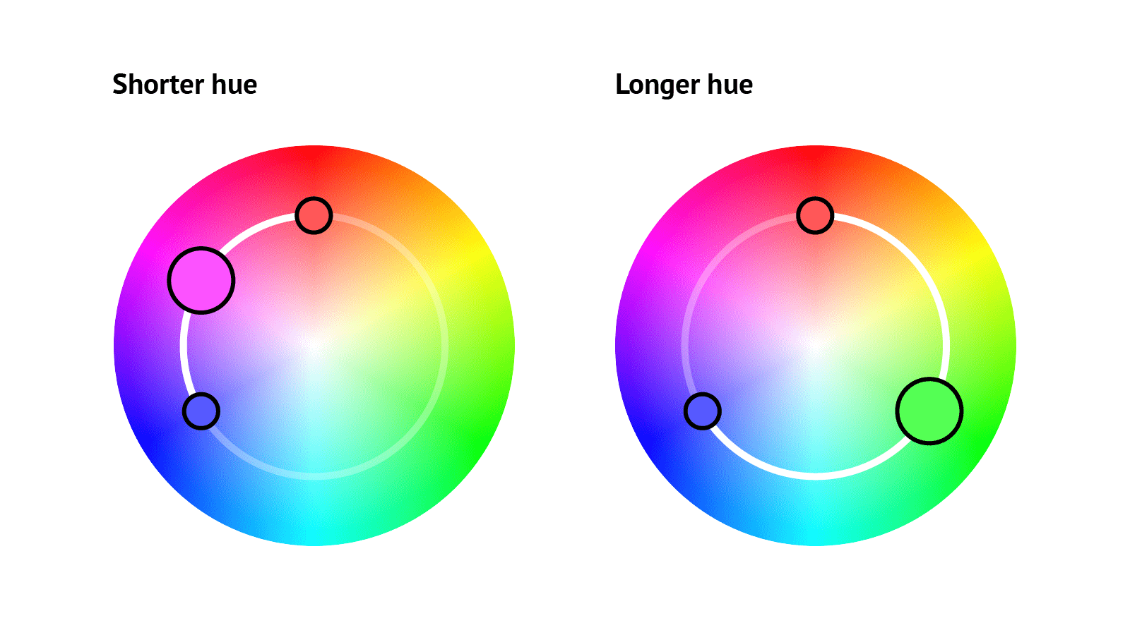
在极性(或圆形)颜色空间中,例如 oklch、oklab 和 hsl,我们还可以选择颜色插值的方向。当我们以相等的比例混合两种颜色时,结果的色相角将是两种颜色角度之间的一半。这会因插值遵循颜色圆上的较短路径还是较长路径而有所不同。
color-mix(in hsl, rgb(255 88 88), rgb(86 86 255));
color-mix(in hsl longer hue, rgb(255 88 88), rgb(86 86 255));
在下面的框架中,通过混合不同颜色空间中的颜色来实验,以观察结果。
<div class="controls">
  <label for="amount">Amount</label>
  <input type="range" min="0" max="100" id="amount" />

  <label for="c1">Color 1</label>
  <input type="color" id="c1" value="#FF0000" data-color />

  <label for="c2">Color 2</label>
  <input type="color" id="c2" value="#0000FF" data-color />

  <fieldset>
    <p>Interpolation method</p>
    <input type="radio" id="shorter" name="method" value="shorter" checked />
    <label for="shorter">Shorter</label>
    <input type="radio" id="longer" name="method" value="longer" />
    <label for="longer">Longer</label>
  </fieldset>

  <fieldset>
    <p>Color space</p>
    <input type="radio" id="srgb" name="space" value="srgb" checked />
    <label for="srgb">srgb</label>

    <input type="radio" id="oklch" name="space" value="oklch" />
    <label for="oklch">oklch</label>

    <input type="radio" id="hsl" name="space" value="hsl" />
    <label for="hsl">hsl</label>
  </fieldset>
</div>
<p data-text hidden></p>
* {
  box-sizing: border-box;
}

body {
  --c1: red;
  --c2: blue;
  --amount1: 50%;
  --amount2: 50%;
  background: color-mix(
    in var(--space, srgb),
    var(--c1) var(--amount1),
    var(--c2) var(--amount2)
  );
  display: grid;
  grid-template-columns: auto 1fr;
  gap: 1rem;
  min-height: 100vh;
  margin: 0;
  font-family: "Helvetica", sans-serif;
}

.controls {
  max-width: 20rem;
  padding: 1rem;
  background: white;
  display: grid;
  grid-template-columns: auto 1fr;
  gap: 1rem;
  align-items: center;
  max-height: 100vh;
  overflow: auto;
}

fieldset {
  grid-column: 1 / span 2;
  display: grid;
  grid-template-columns: subgrid;
  gap: 0.5rem;
  padding: 0.75rem;

  p {
    grid-column: span 2;
    margin: 0;
  }
}

[data-text] {
  align-self: center;
  background: rgb(255 255 255 / 0.7);
  padding: 1rem;
  margin: 1rem;
  border-radius: 0.5rem;
  text-align: center;
  line-height: 1.4;
}
const amountInput = document.querySelector("#amount");
const text = document.querySelector("[data-text]");
const colorInputs = document.querySelectorAll("[data-color]");
const colorSpaceInputs = [...document.querySelectorAll('[name="space"]')];
const methodInputs = [...document.querySelectorAll('[name="method"]')];

const setAmounts = (value) => {
  document.body.style.setProperty("--amount1", `${value}%`);
  document.body.style.setProperty("--amount2", `${100 - value}%`);
};

const getColorSpace = () => {
  const space = colorSpaceInputs.find((el) => el.checked).value;

  if (space === "srgb") return space;

  const method = methodInputs.find((el) => el.checked).value;

  return `${space} ${method} hue`;
};

const setTextContent = (value) => {
  const c1 = getComputedStyle(document.body).getPropertyValue("--c1");
  const c2 = getComputedStyle(document.body).getPropertyValue("--c2");

  text.hidden = false;

  text.innerHTML = `
    <code>color-mix(in ${getColorSpace()}, ${c1} ${value}%, ${c2} ${
      100 - value
    }%)</code>`;
};

amountInput.addEventListener("input", (e) => {
  const { value } = e.target;
  setAmounts(value);
  setTextContent(value);
});

colorInputs.forEach((el) => {
  el.addEventListener("input", (e) => {
    const { id, value } = e.target;
    document.body.style.setProperty(`--${id}`, value);

    setTextContent(amountInput.value);
  });
});

const setColorSpace = () => {
  document.body.style.setProperty("--space", getColorSpace());
};

colorSpaceInputs.forEach((el) => {
  el.addEventListener("change", (e) => {
    const { value } = e.target;
    setColorSpace(value);
    setTextContent(amountInput.value);
  });
});

methodInputs.forEach((el) => {
  el.addEventListener("change", () => {
    const space = colorSpaceInputs.find((el) => el.checked).value;
    setColorSpace();
    setTextContent(amountInput.value);
  });
});

setAmounts(amountInput.value);
setTextContent(amountInput.value);
setColorSpace();
自 2023 年中期以来,所有现代浏览器都支持 color-mix() 函数。一如既往,请记住并非所有用户都会拥有最新的浏览器。确保每个人都能获得可用体验的一种方法是设置初始颜色值。不支持 color-mix() 的浏览器将忽略第二个声明。
div {
  /* First declaration is fallback for browsers that do not support color-mix() */
  background: rgb(150 0 255);
  background: color-mix(in srgb, blue, red);
}
或者,我们可以使用功能查询来检测浏览器是否支持 color-mix() 并提供相应的样式
.card {
  background: lightblue;
}

@supports (color-mix(in srgb, blue, white)) {
  .card {
    --color: blue;
    background: color-mix(in srgb, var(--color), white 80%);
    border-top: 5px solid var(--color);
  }
}
如果您使用 PostCSS,有一个 PostCSS 插件,它捆绑在 postcss-preset-env 中。这个插件允许您编写 color-mix() 函数,而不必担心浏览器支持,因为您的代码在构建时会自动转换为跨浏览器兼容的 CSS。例如
.some-element {
  background-color: color-mix(in srgb, red, blue);
}
会变成
.some-element {
  background-color: rgb(128 0 128);
}
值得注意的是,这仅适用于静态值,而不适用于自定义属性或 JavaScript 中设置的动态值。
我们已经了解了如何使用 color-mix() 创建颜色变体,以及该函数如何与自定义属性结合使用以用于项目和设计系统。由于浏览器支持已经相当不错,我们可以期待 Web 上处理颜色的新时代!

 Michelle Barker
阅读时间 7 分钟
Michelle Barker
阅读时间 7 分钟