卡片
这种模式是“卡片”组件的列表,带有可选的页脚。一张卡片包含标题、图片、描述或其他内容,以及署名或页脚。卡片通常以组或集合的形式显示。
依赖项
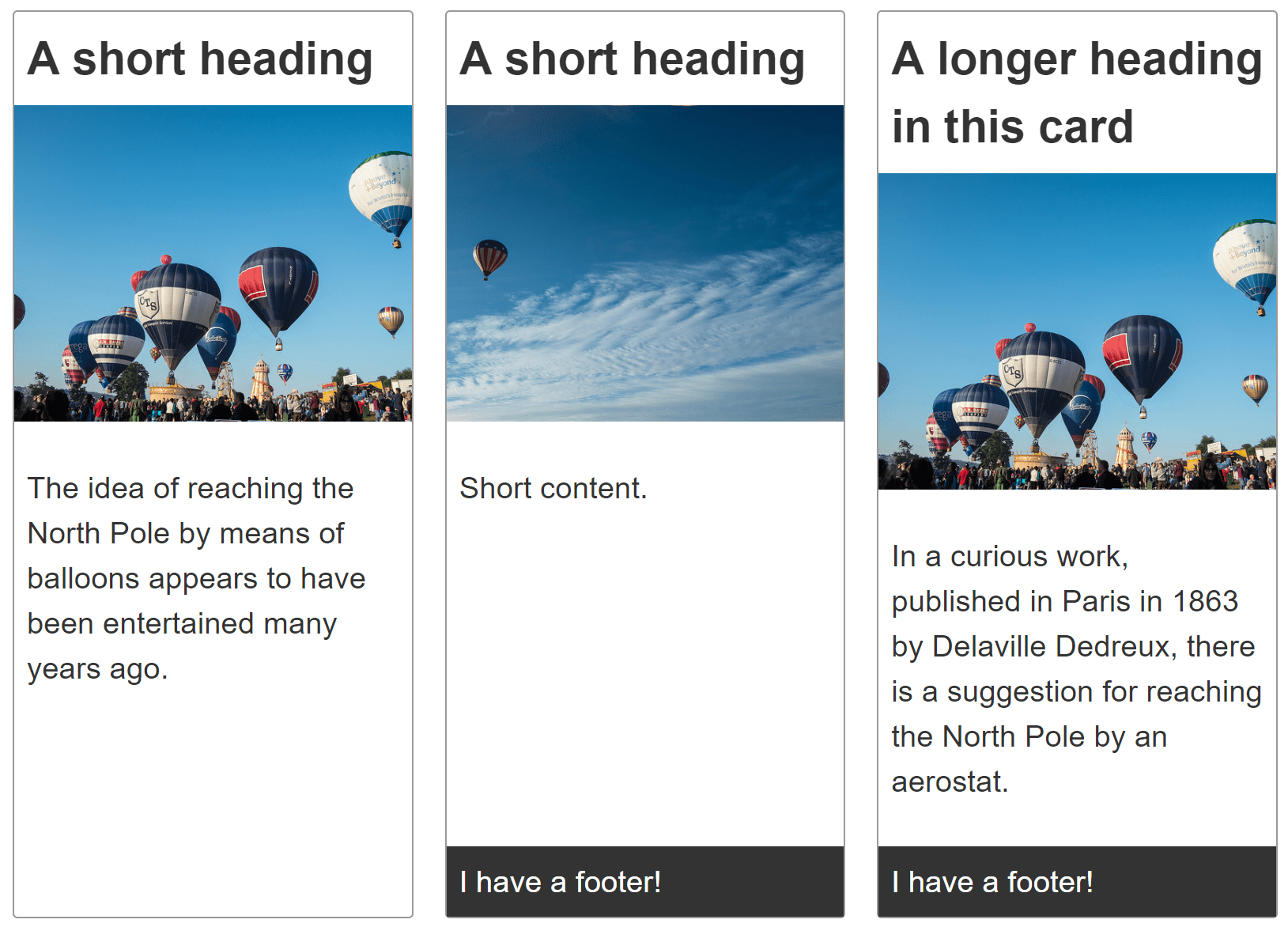
创建一个卡片组,每个卡片组件都包含标题、图片、内容,以及可选的页脚。
卡片组中的每张卡片应该具有相同的高度。可选的卡片页脚应该紧贴卡片底部。
卡片组中的卡片应该在两个维度上对齐——垂直和水平。
示例
点击下面代码块中的“Play”按钮,在 MDN Playground 中编辑示例。
<div class="cards">
  <article class="card">
    <header>
      <h2>A short heading</h2>
    </header>

    <img
      src="https://mdn.github.io/shared-assets/images/examples/balloons.jpg"
      alt="Hot air balloons" />
    <div class="content">
      <p>
        The idea of reaching the North Pole by means of balloons appears to have
        been entertained many years ago.
      </p>
    </div>
  </article>

  <article class="card">
    <header>
      <h2>A short heading</h2>
    </header>

    <img
      src="https://mdn.github.io/shared-assets/images/examples/balloons2.jpg"
      alt="Hot air balloons" />
    <div class="content">
      <p>Short content.</p>
    </div>
    <footer>I have a footer!</footer>
  </article>

  <article class="card">
    <header>
      <h2>A longer heading in this card</h2>
    </header>

    <img
      src="https://mdn.github.io/shared-assets/images/examples/balloons.jpg"
      alt="Hot air balloons" />
    <div class="content">
      <p>
        In a curious work, published in Paris in 1863 by Delaville Dedreux,
        there is a suggestion for reaching the North Pole by an aerostat.
      </p>
    </div>
    <footer>I have a footer!</footer>
  </article>
  <article class="card">
    <header>
      <h2>A short heading</h2>
    </header>

    <img
      src="https://mdn.github.io/shared-assets/images/examples/balloons2.jpg"
      alt="Hot air balloons" />
    <div class="content">
      <p>
        The idea of reaching the North Pole by means of balloons appears to have
        been entertained many years ago.
      </p>
    </div>
  </article>
</div>
body {
  font: 1.2em sans-serif;
}

img {
  max-width: 100%;
}

.cards {
  max-width: 700px;
  margin: 1em auto;

  display: grid;
  grid-template-columns: repeat(auto-fill, minmax(230px, 1fr));
  grid-gap: 20px;
}

.card {
  border: 1px solid #999999;
  border-radius: 3px;

  display: grid;
  grid-template-rows: max-content 200px 1fr;
}

.card img {
  object-fit: cover;
  width: 100%;
  height: 100%;
}

.card h2 {
  margin: 0;
  padding: 0.5rem;
}

.card .content {
  padding: 0.5rem;
}

.card footer {
  background-color: #333333;
  color: white;
  padding: 0.5rem;
}
已做出的选择
尽管布局是一维的,但每张卡片都使用CSS 网格布局进行布局。这使得网格轨道能够使用内容尺寸。要设置单列网格,我们可以使用以下内容:
.card {
  display: grid;
  grid-template-rows: max-content 200px 1fr;
}
display: grid 将元素转换为网格容器。grid-template-rows 属性的三个值将网格分为至少三行,按顺序定义卡片前三个子元素的高度。
每个card按顺序包含<header>、<img>和<div>,其中一些还包含<footer>。
标题行或轨道设置为max-content,这可以防止它拉伸。图片轨道设置为200像素高。第三个轨道,即内容所在的位置,设置为1fr。这意味着它将填充任何额外空间。
除了三个具有明确定义尺寸的子元素之外,任何子元素都会在隐式网格中创建行,这些行适合添加的内容。默认情况下,这些行是自动调整大小的。如果卡片包含页脚,则页脚是自动调整大小的。当存在页脚时,它会粘在网格的底部。页脚会自动调整大小以适应其内容;然后内容<div>会拉伸以占据任何额外空间。
以下规则集创建了卡片网格:
.cards {
  display: grid;
  grid-template-columns: repeat(auto-fill, minmax(230px, 1fr));
  gap: 20px;
}
grid-template-columns 属性定义了网格列的宽度。在这种情况下,我们将网格设置为自动填充,重复的列最小为230px,但允许其增长以填充可用空间。gap 属性设置了相邻行和相邻列之间20px的间隙。
注意:不同卡片中的各个元素彼此不对齐,因为每张卡片都是一个独立的网格。可以使用子网格来使每张卡片中的组件与相邻卡片中的相同组件对齐。
替代方法
Flexbox 也可以用于布局每张卡片。使用 Flexbox,每张卡片行的尺寸由每行的flex 属性设置,而不是在卡片容器上设置。
使用 flexbox,弹性项目的尺寸是在子元素上定义的,而不是在父元素上定义的。选择使用 grid 还是 flexbox 取决于您的偏好,是喜欢从容器控制轨道还是喜欢为项目添加规则。
我们为卡片选择了网格,因为通常情况下,您希望卡片在垂直和水平方向上都对齐。此外,可以使用子网格将每张卡片中的组件与相邻卡片的组件对齐。Flex 没有与子网格等效的无技巧方法。
可访问性考虑
根据卡片的内容,您可能需要或应该采取一些措施来增强可访问性。请参阅 Heydon Pickering 的包容性组件:卡片,获取这些问题的非常详细的解释。