使用 CSS 为 Vue 组件设置样式
终于到了让我们的应用程序看起来更漂亮的时候了。在本文中,我们将探讨使用 CSS 为 Vue 组件设置样式的各种方法。
| 预备知识 |
熟悉核心 HTML、CSS 和 JavaScript 语言,了解 终端/命令行。 Vue 组件由管理应用程序数据的 JavaScript 对象和映射到底层 DOM 结构的基于 HTML 的模板语法组合编写而成。为了安装和使用 Vue 的一些更高级功能(如单文件组件或渲染函数),您需要一个安装了 Node + npm 的终端。 |
|---|---|
| 目标 | 学习如何为 Vue 组件设置样式。 |
使用 CSS 为 Vue 组件设置样式
在我们将更多高级功能添加到应用程序之前,我们应该添加一些基本的 CSS 来使其看起来更好。Vue 有三种常见的应用程序样式设置方法:
- 外部 CSS 文件。
- 单文件组件(
.vue文件)中的全局样式。 - 单文件组件中的组件作用域样式。
为了帮助您熟悉其中的每一种,我们将结合使用这三种方法,让我们的应用程序拥有更美观的外观和感觉。
使用外部 CSS 文件进行样式设置
您可以包含外部 CSS 文件并将它们全局应用于您的应用程序。让我们看看如何做到这一点。
首先,在 src/assets 目录中创建一个名为 reset.css 的文件。此文件夹中的文件会经过 webpack 处理。这意味着我们可以使用 CSS 预处理器(如 SCSS)或后处理器(如 PostCSS)。
尽管本教程不会使用此类工具,但值得注意的是,当将此类代码包含在 assets 文件夹中时,它将自动进行处理。
将以下内容添加到 reset.css 文件中
/* reset.css */
/* RESETS */
*,
*::before,
*::after {
  box-sizing: border-box;
}
*:focus {
  outline: 3px dashed #228bec;
}
html {
  font: 62.5% / 1.15 sans-serif;
}
h1,
h2 {
  margin-bottom: 0;
}
ul {
  list-style: none;
  padding: 0;
}
button {
  border: none;
  margin: 0;
  padding: 0;
  width: auto;
  overflow: visible;
  background: transparent;
  color: inherit;
  font: inherit;
  line-height: normal;
  -webkit-font-smoothing: inherit;
  -moz-osx-font-smoothing: inherit;
  appearance: none;
}
button::-moz-focus-inner {
  border: 0;
}
button,
input,
optgroup,
select,
textarea {
  font-family: inherit;
  font-size: 100%;
  line-height: 1.15;
  margin: 0;
}
button,
input {
  /* 1 */
  overflow: visible;
}
input[type="text"] {
  border-radius: 0;
}
body {
  width: 100%;
  max-width: 68rem;
  margin: 0 auto;
  font:
    1.6rem/1.25 "Helvetica Neue",
    "Helvetica",
    "Arial",
    sans-serif;
  background-color: whitesmoke;
  color: #4d4d4d;
  -moz-osx-font-smoothing: grayscale;
  -webkit-font-smoothing: antialiased;
}
@media screen and (width >= 620px) {
  body {
    font-size: 1.9rem;
    line-height: 1.31579;
  }
}
/* END RESETS */
接下来,在您的 src/main.js 文件中,像这样导入 reset.css 文件
import "./assets/reset.css";
这将导致该文件在构建步骤中被拾取并自动添加到我们的站点。
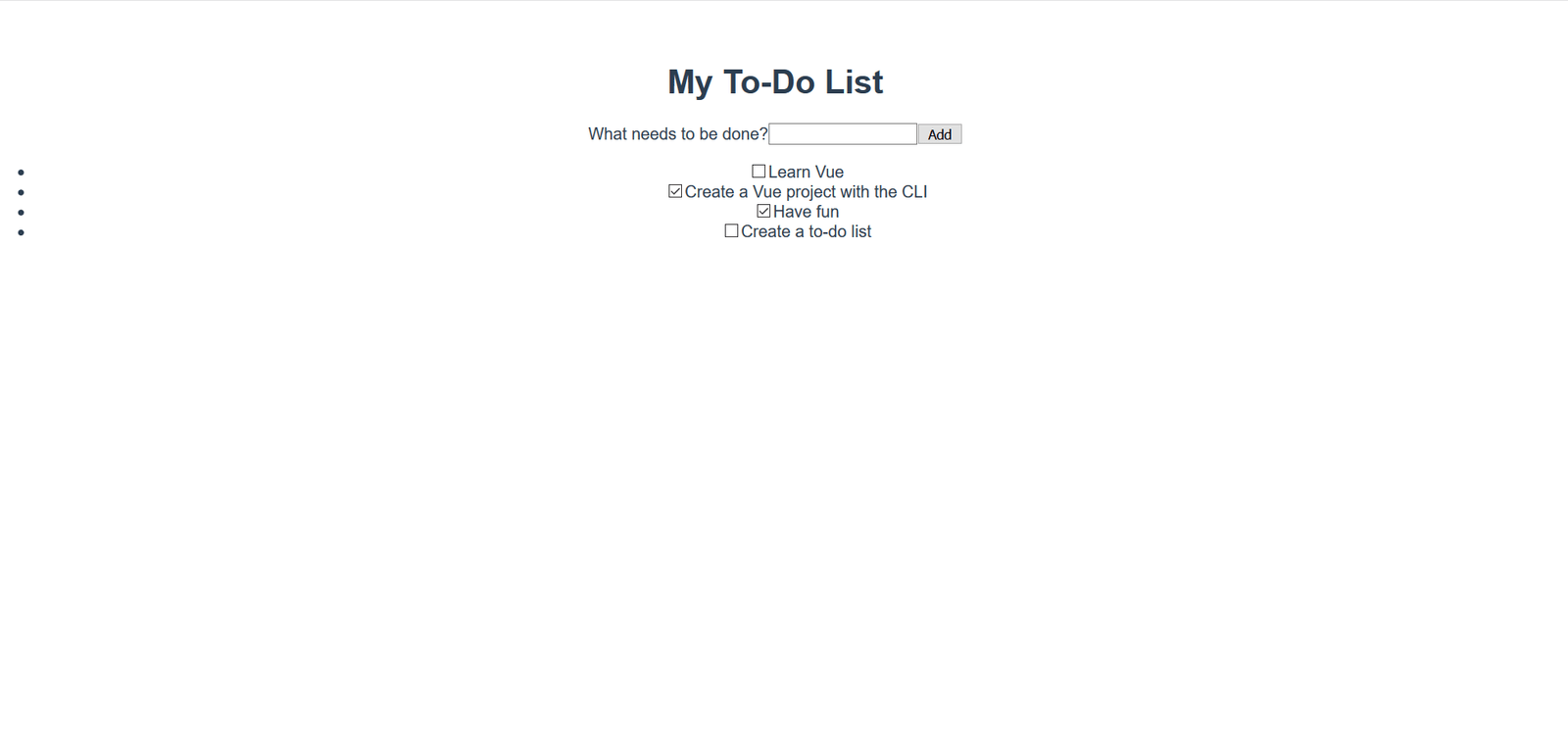
现在应该已经将重置样式应用于应用程序。下图显示了应用重置样式之前和之后的应用程序外观。
之前
之后
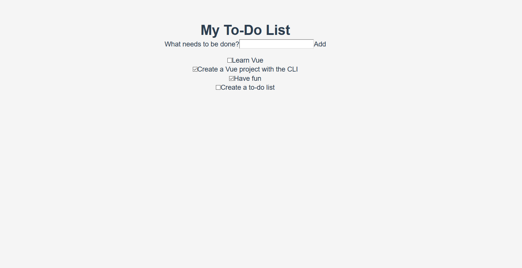
明显的变化包括列表项目符号的移除、背景颜色的改变,以及基本按钮和输入框样式的改变。
在单文件组件中添加全局样式
现在我们已经将 CSS 重置为在浏览器之间保持一致,我们需要进一步自定义样式。有一些样式是我们希望应用于应用程序中所有组件的。虽然将这些样式直接添加到 reset.css 样式表中也可以,但我们将把它们添加到 App.vue 的 <style> 标签中,以演示如何使用它。
文件中已经存在一些样式。让我们删除它们,并用下面的样式替换它们。这些样式做了几件事——为按钮和输入框添加了一些样式,并自定义了 #app 元素及其子元素。
更新您的 App.vue 文件的 <style> 元素,使其看起来像这样
<style>
/* Global styles */
.btn {
  padding: 0.8rem 1rem 0.7rem;
  border: 0.2rem solid #4d4d4d;
  cursor: pointer;
  text-transform: capitalize;
}
.btn__danger {
  color: white;
  background-color: #ca3c3c;
  border-color: #bd2130;
}
.btn__filter {
  border-color: lightgrey;
}
.btn__danger:focus {
  outline-color: #c82333;
}
.btn__primary {
  color: white;
  background-color: black;
}
.btn-group {
  display: flex;
  justify-content: space-between;
}
.btn-group > * {
  flex: 1 1 auto;
}
.btn-group > * + * {
  margin-left: 0.8rem;
}
.label-wrapper {
  margin: 0;
  flex: 0 0 100%;
  text-align: center;
}
[class*="__lg"] {
  display: inline-block;
  width: 100%;
  font-size: 1.9rem;
}
[class*="__lg"]:not(:last-child) {
  margin-bottom: 1rem;
}
@media screen and (width >= 620px) {
  [class*="__lg"] {
    font-size: 2.4rem;
  }
}
.visually-hidden {
  position: absolute;
  height: 1px;
  width: 1px;
  overflow: hidden;
  clip: rect(1px, 1px, 1px, 1px);
  clip-path: rect(1px 1px 1px 1px);
  white-space: nowrap;
}
[class*="stack"] > * {
  margin-top: 0;
  margin-bottom: 0;
}
.stack-small > * + * {
  margin-top: 1.25rem;
}
.stack-large > * + * {
  margin-top: 2.5rem;
}
@media screen and (width >= 550px) {
  .stack-small > * + * {
    margin-top: 1.4rem;
  }
  .stack-large > * + * {
    margin-top: 2.8rem;
  }
}
/* End global styles */
#app {
  background: white;
  margin: 2rem 0 4rem 0;
  padding: 1rem;
  padding-top: 0;
  position: relative;
  box-shadow:
    0 2px 4px 0 rgb(0 0 0 / 20%),
    0 2.5rem 5rem 0 rgb(0 0 0 / 10%);
}
@media screen and (width >= 550px) {
  #app {
    padding: 4rem;
  }
}
#app > * {
  max-width: 50rem;
  margin-left: auto;
  margin-right: auto;
}
#app > form {
  max-width: 100%;
}
#app h1 {
  display: block;
  min-width: 100%;
  width: 100%;
  text-align: center;
  margin: 0;
  margin-bottom: 1rem;
}
</style>
如果您查看应用程序,您会发现我们的待办事项列表现在在一个卡片中,并且我们的待办事项项的格式也更好。现在我们可以开始编辑我们的组件以使用其中一些样式了。
在 Vue 中添加 CSS 类
我们应该将按钮 CSS 类应用于 ToDoForm 组件中的 <button>。由于 Vue 模板是有效的 HTML,这与在纯 HTML 中完成的方式相同——通过向元素添加 class="" 属性。
将 class="btn btn__primary btn__lg" 添加到您的表单的 <button> 元素
<button type="submit" class="btn btn__primary btn__lg">Add</button>
既然我们在这里,还可以进行一项语义和样式上的更改。由于我们的表单表示页面的一个特定部分,因此它可以受益于一个 <h2> 元素。然而,标签已经表明了表单的用途。为了避免重复,让我们将标签包装在一个 <h2> 中。我们还可以添加其他一些全局 CSS 样式。我们还将 input__lg 类添加到我们的 <input> 元素。
更新您的 ToDoForm 模板,使其看起来像这样
<template>
  <form @submit.prevent="onSubmit">
    <h2 class="label-wrapper">
      <label for="new-todo-input" class="label__lg">
        What needs to be done?
      </label>
    </h2>
    <input
      type="text"
      id="new-todo-input"
      name="new-todo"
      autocomplete="off"
      v-model.lazy.trim="label"
      class="input__lg" />
    <button type="submit" class="btn btn__primary btn__lg">Add</button>
  </form>
</template>
我们还将在 App.vue 文件中的 <ul> 标签中添加 stack-large 类。这将有助于稍微改善待办事项项之间的间距。
将其更新为如下所示
<ul aria-labelledby="list-summary" class="stack-large">
  …
</ul>
添加作用域样式
我们要设置样式的最后一个组件是我们的 ToDoItem 组件。为了使样式定义靠近组件,我们可以在其中添加一个 <style> 元素。但是,如果这些样式会影响该组件之外的内容,那么追踪负责设置样式的代码并修复问题可能会很困难。这时 scoped 属性就很有用了——它会向您的所有样式附加一个唯一的 HTML data 属性选择器,从而防止它们与全局样式冲突。
要使用 scoped 修饰符,请在 ToDoItem.vue 文件底部创建一个 <style> 元素,并为其指定一个 scoped 属性
<style scoped>
/* … */
</style>
接下来,将以下 CSS 复制到新创建的 <style> 元素中
.custom-checkbox > .checkbox-label {
  font-family: "Arial", sans-serif;
  -webkit-font-smoothing: antialiased;
  -moz-osx-font-smoothing: grayscale;
  font-weight: normal;
  font-size: 1rem;
  line-height: 1.25;
  color: #0b0c0c;
  display: block;
  margin-bottom: 5px;
}
.custom-checkbox > .checkbox {
  font-family: "Arial", sans-serif;
  -webkit-font-smoothing: antialiased;
  -moz-osx-font-smoothing: grayscale;
  font-weight: normal;
  font-size: 1rem;
  line-height: 1.25;
  box-sizing: border-box;
  width: 100%;
  height: 2.5rem;
  margin-top: 0;
  padding: 5px;
  border: 2px solid #0b0c0c;
  border-radius: 0;
  appearance: none;
}
.custom-checkbox > input:focus {
  outline: 3px dashed #ffdd00;
  outline-offset: 0;
  box-shadow: inset 0 0 0 2px;
}
.custom-checkbox {
  font-family: "Arial", sans-serif;
  -webkit-font-smoothing: antialiased;
  font-weight: normal;
  font-size: 1.6rem;
  line-height: 1.25;
  display: block;
  position: relative;
  min-height: 40px;
  margin-bottom: 10px;
  padding-left: 40px;
  clear: left;
}
.custom-checkbox > input[type="checkbox"] {
  -webkit-font-smoothing: antialiased;
  cursor: pointer;
  position: absolute;
  z-index: 1;
  top: -2px;
  left: -2px;
  width: 44px;
  height: 44px;
  margin: 0;
  opacity: 0;
}
.custom-checkbox > .checkbox-label {
  font-size: inherit;
  font-family: inherit;
  line-height: inherit;
  display: inline-block;
  margin-bottom: 0;
  padding: 8px 15px 5px;
  cursor: pointer;
  touch-action: manipulation;
}
.custom-checkbox > label::before {
  content: "";
  box-sizing: border-box;
  position: absolute;
  top: 0;
  left: 0;
  width: 40px;
  height: 40px;
  border: 2px solid currentColor;
  background: transparent;
}
.custom-checkbox > input[type="checkbox"]:focus + label::before {
  border-width: 4px;
  outline: 3px dashed #228bec;
}
.custom-checkbox > label::after {
  box-sizing: content-box;
  content: "";
  position: absolute;
  top: 11px;
  left: 9px;
  width: 18px;
  height: 7px;
  transform: rotate(-45deg);
  border: solid;
  border-width: 0 0 5px 5px;
  border-top-color: transparent;
  opacity: 0;
  background: transparent;
}
.custom-checkbox > input[type="checkbox"]:checked + label::after {
  opacity: 1;
}
@media only screen and (width >= 40rem) {
  label,
  input,
  .custom-checkbox {
    font-size: 1.9rem;
    line-height: 1.31579;
  }
}
现在我们需要将一些 CSS 类添加到我们的模板中,以连接这些样式。
向根 <div> 添加 custom-checkbox 类。向 <input> 添加 checkbox 类。最后,向 <label> 添加 checkbox-label 类。更新后的模板如下
<template>
  <div class="custom-checkbox">
    <input type="checkbox" :id="id" :checked="isDone" class="checkbox" />
    <label :for="id" class="checkbox-label">{{label}}</label>
  </div>
</template>
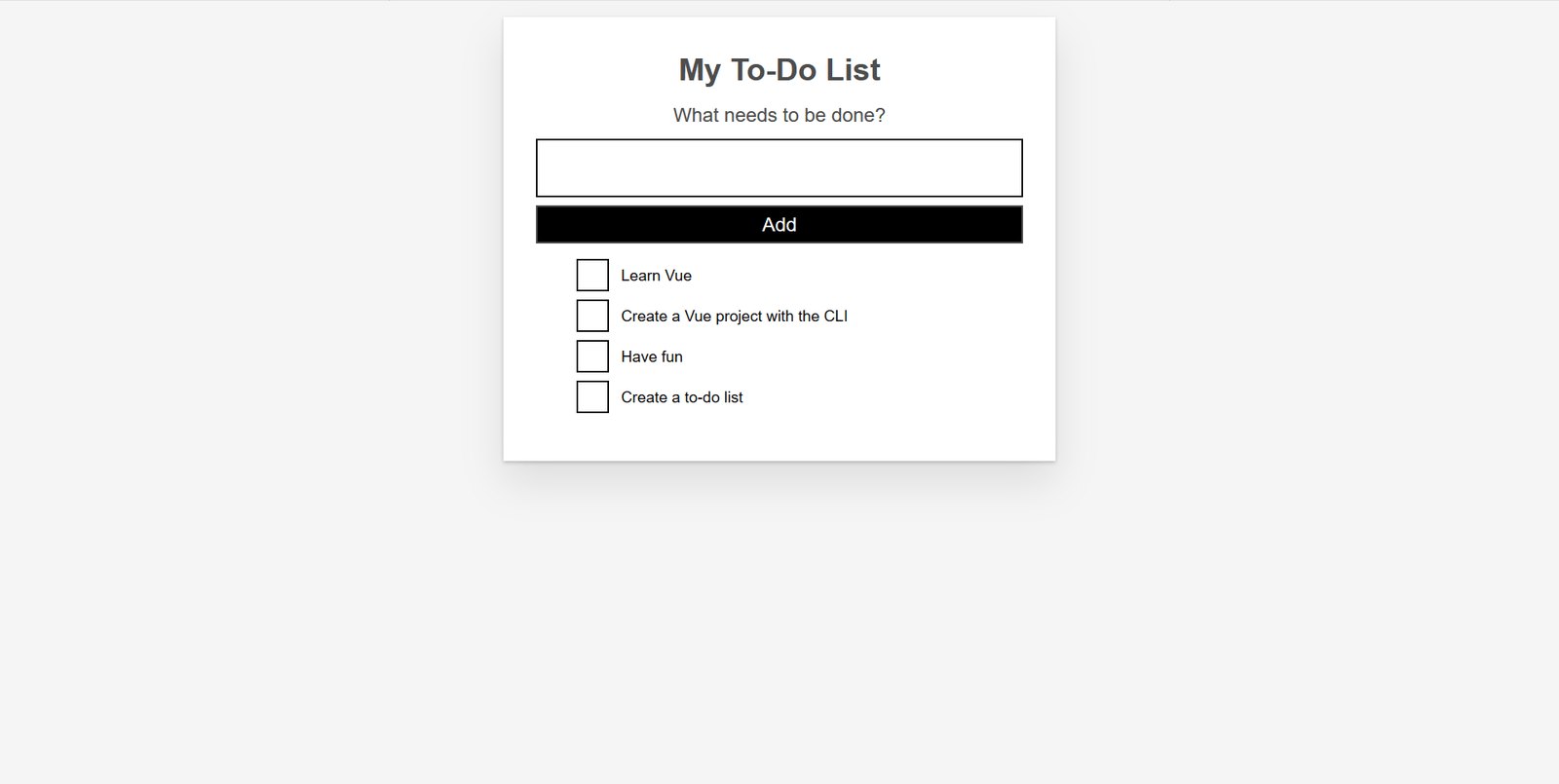
应用程序现在应该有自定义复选框了。您的应用程序外观应类似于下面的截图。
总结
我们的示例应用程序的样式工作已完成。在下一篇文章中,我们将继续添加更多功能,即使用计算属性在应用程序中添加已完成待办事项项的计数。