Window: devicePixelRatio 属性
Window 接口的 devicePixelRatio 属性返回当前显示设备的物理像素分辨率与CSS 像素分辨率的比率。
此值也可以解释为像素尺寸的比率:一个CSS 像素与一个物理像素的尺寸之比。简单来说,它告诉浏览器应该使用屏幕的多少实际像素来绘制单个 CSS 像素。
页面缩放会影响 devicePixelRatio 的值。当页面放大(变大)时,CSS 像素的大小会增加,因此 devicePixelRatio 的值也会增加。捏拉缩放不会影响 devicePixelRatio,因为它会放大页面而不改变 CSS 像素的大小。
在处理标准显示器与 HiDPI 或 Retina 显示器之间的差异时,这一点非常有用,因为 HiDPI 或 Retina 显示器使用更多的屏幕像素来绘制相同的对象,从而产生更清晰的图像。
您可以使用 window.matchMedia() 来检查 devicePixelRatio 的值是否发生变化(例如,当用户将窗口拖到具有不同像素密度的显示器上时,这种情况可能会发生)。请参阅 下面的示例。
值
一个双精度浮点值,表示显示器的物理像素分辨率与 CSS 像素分辨率的比率。值为 1 表示经典的 96 DPI 显示器,而 HiDPI/Retina 显示器的值通常为 2。
在分辨率异常低的显示器的情况下,或者更常见的是,当屏幕的像素密度高于标准 96 DPI 分辨率的两倍时,可能会返回其他值。现代移动设备屏幕——以非常小的物理尺寸提供高显示分辨率——通常会产生大于 2 的 devicePixelRatio 值。
示例
纠正 <canvas> 中的分辨率
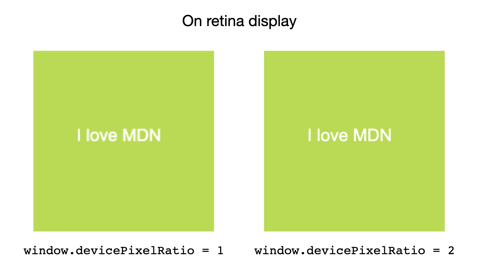
在 Retina 屏幕上,<canvas> 可能会显得过于模糊。使用 window.devicePixelRatio 来确定应添加多少额外的像素密度以获得更清晰的图像。
HTML
<canvas id="canvas"></canvas>
JavaScript
const canvas = document.getElementById("canvas");
const ctx = canvas.getContext("2d");

// Set display size (css pixels).
const size = 200;
canvas.style.width = `${size}px`;
canvas.style.height = `${size}px`;

// Set actual size in memory (scaled to account for extra pixel density).
const scale = window.devicePixelRatio; // Change to 1 on retina screens to see blurry canvas.
canvas.width = Math.floor(size * scale);
canvas.height = Math.floor(size * scale);

// Normalize coordinate system to use CSS pixels.
ctx.scale(scale, scale);

ctx.fillStyle = "#bada55";
ctx.fillRect(10, 10, 300, 300);
ctx.fillStyle = "white";
ctx.font = "18px Arial";
ctx.textAlign = "center";
ctx.textBaseline = "middle";

const x = size / 2;
const y = size / 2;

const textString = "I love MDN";
ctx.fillText(textString, x, y);
监控屏幕分辨率或缩放级别变化
在此示例中,我们将设置一个媒体查询并对其进行监视,以查看设备分辨率何时变化,并记录新分辨率。
HTML
<div id="container">
  <p>
    This example demonstrates the effect of zooming the page in and out (or
    moving it to a screen with a different scaling factor) on the value of the
    <code>devicePixelRatio</code> property.
  </p>
  <p>Try it and watch what happens!</p>
</div>
<div id="output"></div>
CSS
body {
  font:
    22px "Arial",
    sans-serif;
}

#container {
  border: 2px solid #2222dd;
  margin: 1rem auto;
  padding: 1rem;
  background-color: #aa99ff;
}
JavaScript
字符串 mqString 设置为媒体查询,用于检查当前显示分辨率是否与每 px 的特定设备点数匹配。
media 变量是一个使用媒体查询字符串初始化的 MediaQueryList 对象。当使用文档运行 mqString 的结果发生更改时,media 对象的 change 事件会触发,并且代码会记录新分辨率。
请注意,每次分辨率更改时,示例都必须基于新分辨率创建一个新的媒体查询和一个新的 MediaQueryList 实例。
let remove = null;
const output = document.querySelector("#output");

const updatePixelRatio = () => {
  remove?.();
  const mqString = `(resolution: ${window.devicePixelRatio}dppx)`;
  const media = matchMedia(mqString);
  media.addEventListener("change", updatePixelRatio);
  remove = () => {
    media.removeEventListener("change", updatePixelRatio);
  };

  output.textContent = `devicePixelRatio: ${window.devicePixelRatio}`;
};

updatePixelRatio();
结果
要测试此示例,请尝试放大和缩小页面,并注意记录的 devicePixelRatio 值的差异。
规范
| 规范 |
|---|
| CSSOM 视图模块 # dom-window-devicepixelratio |
浏览器兼容性
加载中…