在 CSS 网格布局中对齐项目
CSS 网格布局实现了 CSS 盒模型对齐,这与 Flexbox 在其弹性容器中对齐项目所使用的标准相同。对齐模块详细说明了对齐在所有布局方法中应该如何工作。
在本指南中,我们将了解如何使用盒模型对齐属性来对齐网格布局中的项目。
你可能会注意到这些属性和值在 Flexbox 中的工作方式有相似之处。由于网格是二维的,而 Flexbox 是一维的,因此存在一些需要注意的细微差别。因此,我们将首先了解在网格中对齐项目时需要处理的两个轴。
网格布局的两个轴
使用网格布局时,有两个轴可供对齐——块轴和行内轴。块轴是在块级布局中块的排列轴。如果页面上有两个段落,它们会一个接一个地显示,因此我们将这个方向描述为块轴。
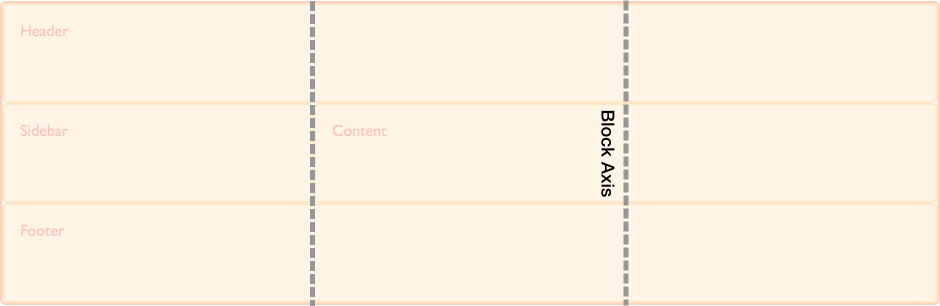
行内轴与块轴交叉,它是常规行内流中文本的走向。
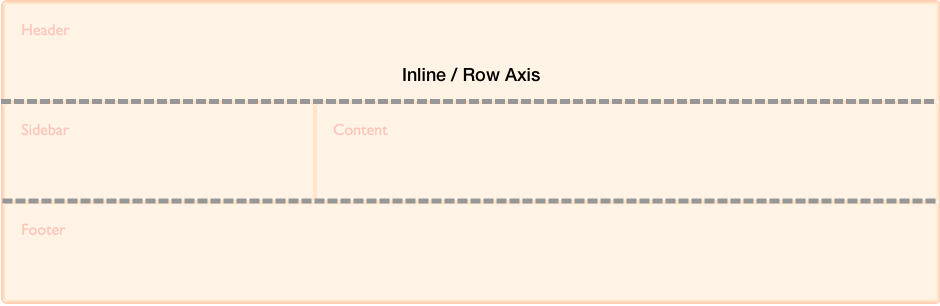
我们能够在这两个轴上对齐网格区域内的内容以及网格轨道本身。
在块轴上对齐项目
align-self 和 align-items 属性控制块轴上的对齐。当我们使用这些属性时,我们正在改变项目在你放置它的网格区域内的对齐方式。
使用 align-items
在下面的示例中,我们的网格中有四个网格区域。我们可以在网格容器上使用 align-items 属性,使用 normal、stretch 或 <self-position> 或 <baseline-position> 值来对齐项目。
normalstretchstartendcenterbaselinefirst baselinelast baselineauto(仅用于align-self)
默认值是 normal,对于网格容器,它解析为 stretch。
.wrapper {
display: grid;
grid-template-columns: repeat(8, 1fr);
gap: 10px;
grid-auto-rows: 100px;
grid-template-areas:
"a a a a b b b b"
"a a a a b b b b"
"c c c c d d d d"
"c c c c d d d d";
align-items: start;
}
.item1 {
grid-area: a;
}
.item2 {
grid-area: b;
}
.item3 {
grid-area: c;
}
.item4 {
grid-area: d;
}
<div class="wrapper">
<div class="item1">Item 1</div>
<div class="item2">Item 2</div>
<div class="item3">Item 3</div>
<div class="item4">Item 4</div>
</div>
请记住,一旦你设置了 align-items: start,每个子 <div> 的高度将由 <div> 的内容决定。这与完全省略 align-items 的情况相反,在后者中,每个 <div> 的高度会拉伸以填充其网格区域。
align-items 属性为所有子网格项目设置了 align-self 属性。这意味着你可以通过直接在网格项目上使用 align-self 来单独设置该属性。
使用 align-self
在下一个示例中,我们使用 align-self 属性来演示不同的对齐值。第一个区域显示 align-self 的默认行为,在本例中解析为 stretch。第二个项目,align-self 值为 start,第三个为 end,第四个为 center。
.wrapper {
display: grid;
grid-template-columns: repeat(8, 1fr);
gap: 10px;
grid-auto-rows: 100px;
grid-template-areas:
"a a a a b b b b"
"a a a a b b b b"
"c c c c d d d d"
"c c c c d d d d";
}
.item1 {
grid-area: a;
}
.item2 {
grid-area: b;
align-self: start;
}
.item3 {
grid-area: c;
align-self: end;
}
.item4 {
grid-area: d;
align-self: center;
}
<div class="wrapper">
<div class="item1">Item 1</div>
<div class="item2">Item 2</div>
<div class="item3">Item 3</div>
<div class="item4">Item 4</div>
</div>
具有固有宽高比的项目
align-self 的默认行为是从网格容器的 align-items 属性继承,其 normal 默认值为 stretch,但具有固有宽高比的项目除外,在这种情况下,它们的行为类似于 start。原因是,如果具有宽高比的项目被拉伸,它们会变形。
在行内轴上调整项目
align-items 和 align-self 在块轴上对齐项目,而 justify-items 和 justify-self 则在行内轴上对齐项目。你可以选择的值与 align-self 属性的 normal、stretch、<self-position> 和 <baseline-position> 值相似,此外还有 left 和 right。值包括:
normalstartendleftrightcenterstretchbaselinefirst baselinelast baselineauto(仅用于justify-self)
你可以在下面看到与 align-items 相同的示例。这一次,我们应用的是 justify-self 属性。
同样,默认值是 stretch,除非项目具有固有宽高比。这意味着网格项目默认会覆盖其网格区域,除非你更改对齐方式。在此示例中,第一个项目演示了默认的 stretch 对齐值。
.wrapper {
display: grid;
grid-template-columns: repeat(8, 1fr);
gap: 10px;
grid-auto-rows: 100px;
grid-template-areas:
"a a a a b b b b"
"a a a a b b b b"
"c c c c d d d d"
"c c c c d d d d";
}
.item1 {
grid-area: a;
}
.item2 {
grid-area: b;
justify-self: start;
}
.item3 {
grid-area: c;
justify-self: end;
}
.item4 {
grid-area: d;
justify-self: center;
}
<div class="wrapper">
<div class="item1">Item 1</div>
<div class="item2">Item 2</div>
<div class="item3">Item 3</div>
<div class="item4">Item 4</div>
</div>
与 align-self 和 align-items 一样,你可以将 justify-items 应用于网格容器,为容器内的所有网格项目设置 justify-self 值。
注意: justify-self 和 justify-items 属性并未在 Flexbox 中实现。这是由于 Flexbox 的一维特性,并且轴上可能有多个项目,使得无法调整单个项目。要在 Flexbox 中沿主轴(行内轴)对齐项目,请使用 justify-content 属性。
简写属性
place-items 属性是 align-items 和 justify-items 的简写。
place-self 属性是 align-self 和 justify-self 的简写。
在区域内居中一个项目
通过结合 align 和 justify 属性,我们可以轻松地将一个项目在网格区域内居中。
.wrapper {
display: grid;
grid-template-columns: repeat(4, 1fr);
gap: 10px;
grid-auto-rows: 200px;
grid-template-areas:
". a a ."
". a a .";
}
.item1 {
grid-area: a;
align-self: center;
justify-self: center;
}
<div class="wrapper">
<div class="item1">Item 1</div>
</div>
在块轴上对齐网格轨道
如果你遇到网格轨道使用的区域小于网格容器的情况,你可以在该容器内对齐网格轨道本身。align-content 在块轴上对齐轨道,justify-content 在行内轴上对齐。与 *-items 和 *-item 属性一样,place-content 属性是 align-content 和 justify-content 的简写。
align-content、justify-content 和 place-content 的值都包括 <content-distribution> 和 <content-position> 值。align-content 属性还接受 <baseline-position> 值,并且像其他 justify-* 属性一样,justify-content 也接受 left 和 right。
place-content 的有效关键字包括:
normalstartendcenterstretchspace-aroundspace-betweenspace-evenlybaselinefirst baselinelast baselineleftright
align-content 属性应用于网格容器,因为它作用于整个网格。
默认对齐
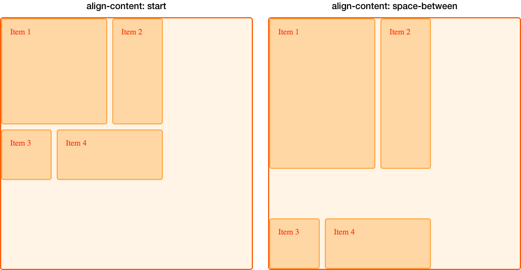
在这个例子中,一个 500px 乘 500px 的网格容器有三个 100px 的行轨道和三个 100px 的列轨道,以及 10px 的间隙。这意味着在网格容器内,块方向和行内方向都有空间。
默认情况下,我们的网格轨道位于网格的左上角,与起始网格线对齐,因为网格布局中的默认行为是 start。
* {
  box-sizing: border-box;
}

.wrapper {
  border: 2px solid #f76707;
  border-radius: 5px;
  background-color: #fff4e6;
}

.wrapper > div {
  border: 2px solid #ffa94d;
  border-radius: 5px;
  background-color: #ffd8a8;
  padding: 1em;
  color: #d9480f;
}
.wrapper {
display: grid;
grid-template-columns: repeat(3, 100px);
grid-template-rows: repeat(3, 100px);
height: 500px;
width: 500px;
gap: 10px;
grid-template-areas:
"a a b"
"a a b"
"c d d";
}
.item1 {
grid-area: a;
}
.item2 {
grid-area: b;
}
.item3 {
grid-area: c;
}
.item4 {
grid-area: d;
}
<div class="wrapper">
  <div class="item1">Item 1</div>
  <div class="item2">Item 2</div>
  <div class="item3">Item 3</div>
  <div class="item4">Item 4</div>
</div>
设置 align-content: end
使用相同的 CSS 和 HTML,在这个例子中,我们向容器添加了值为 end 的 align-content,因此所有轨道都移动到网格容器在块维度上的结束线。
.wrapper {
align-content: end;
}
设置 align-content: space-between
我们还可以应用 <content-distribution> 的空间分布值,如 space-between、space-around、space-evenly 和 stretch。在这个例子中,我们将 align-content 设置为 space-between,它在块轴上对齐轨道,从而将轨道分散开。
.wrapper {
align-content: space-between;
}
如果一个项目跨越了多个网格轨道,使用空间分布值可能会导致网格上的项目变大,因为轨道之间增加的空间会加到跨越项目上。因此,如果你使用这些值,请确保轨道的内容可以应对额外的空间,或者你已在项目上使用了对齐属性,使它们移动到开始或结束位置而不是拉伸。
在下图中,我们用两种不同的 align-content 值放置了网格,以比较 start 和 space-between。你可以看到,在 space-between 的例子中,前两个跨越两个行轨道的项目如何获得了额外的高度,因为它们获得了由于三行之间自由空间分布而产生的空间。
在行内轴上调整网格轨道
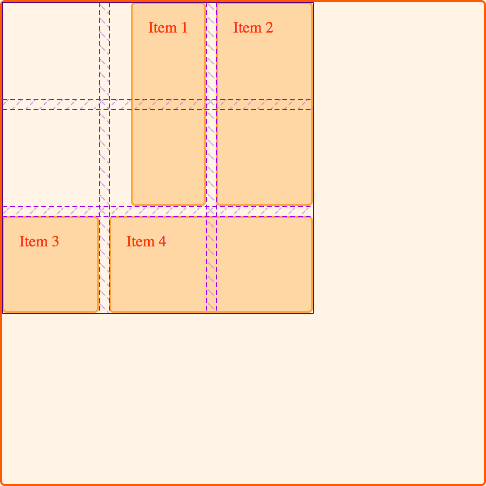
我们可以使用 justify-content 在行内轴上执行与我们在块轴上使用 align-content 相同的对齐方式。
使用相同的例子,我们将 justify-content 设置为 space-around。这再次导致跨越多个列轨道的轨道获得额外的空间。
.wrapper {
align-content: space-between;
justify-content: space-around;
}
对齐和自动外边距
另一种在区域内对齐项目的方法是使用自动外边距。如果你曾经在视口中居中过布局,或在任何父元素内居中块级元素,你可能是通过将要居中的元素的左右外边距设置为 auto 来实现的。自动外边距会吸收所有可用空间。在两侧都设置 auto 外边距会将块级元素推到中间,因为两边的外边距都试图占据所有空间。
在下一个例子中,项目 1 的 margin-left 属性被设置为 auto。这会将内容推到区域的右侧,因为自动外边距占用了内容所需空间分配后剩余的可用空间。
.wrapper {
display: grid;
grid-template-columns: repeat(3, 100px);
grid-template-rows: repeat(3, 100px);
height: 500px;
width: 500px;
gap: 10px;
grid-template-areas:
"a a b"
"a a b"
"c d d";
}
.item1 {
grid-area: a;
margin-left: auto;
}
.item2 {
grid-area: b;
}
.item3 {
grid-area: c;
}
.item4 {
grid-area: d;
}
<div class="wrapper">
  <div class="item1">Item 1</div>
  <div class="item2">Item 2</div>
  <div class="item3">Item 3</div>
  <div class="item4">Item 4</div>
</div>
使用浏览器开发者工具中的网格检查器来查看项目是如何对齐的。
对齐和书写模式
所有这些示例都是在英语环境下,一种从左到右的语言。这意味着从物理方向上考虑,我们的起始线位于网格的顶部和左侧。
CSS 网格布局和 CSS 盒模型对齐与 CSS 中的书写模式协同工作。当显示从右到左的语言(如阿拉伯语)时,网格的起始点是右上角,因此 justify-content: start 的默认行为是网格轨道从网格的右侧开始。
设置物理属性,例如使用 margin-right 或 margin-left 设置自动外边距,或者使用 top、right、bottom 和 left 偏移量进行绝对定位,这些都不会遵循书写模式。在网格、逻辑值和书写模式指南中,我们将进一步探讨 CSS 网格布局、盒模型对齐和书写模式之间的这种交互。如果你开发需要在多种语言中显示的网站,或者想在设计中混合语言或书写模式,理解这一点将非常重要。