radial-gradient()
Baseline 广泛可用 *
radial-gradient() CSS 函数会创建一个由两种或多种颜色组成的、从原点辐射出来的渐进式过渡的图像。其形状可以是圆形或椭圆形。该函数的结果是一个 <gradient> 数据类型的对象,这是一种特殊的 <image>。
试一试
background: radial-gradient(#e66465, #9198e5);
background: radial-gradient(closest-side, #3f87a6, #ebf8e1, #f69d3c);
background: radial-gradient(
  circle at 100%,
  #333333,
  #333333 50%,
  #eeeeee 75%,
  #333333 75%
);
background:
  radial-gradient(ellipse at top, #e66465, transparent),
  radial-gradient(ellipse at bottom, #4d9f0c, transparent);
<section class="display-block" id="default-example">
  <div id="example-element"></div>
</section>
#example-element {
  min-height: 100%;
}
语法
/* A gradient with a single color of red */
radial-gradient(red)

/* A gradient at the center of its container,
   starting red, changing to blue, and finishing green */
radial-gradient(circle at center, red 0, blue, green 100%)

/* hsl color space with longer hue interpolation */
radial-gradient(circle at center in hsl longer hue, red 0, blue, green 100%)
径向渐变通过指定渐变的中心(0% 椭圆所在的位置)以及结束形状(100% 椭圆)的大小和形状来定义。
值
<position>-
渐变的位置,其解析方式与
background-position或transform-origin相同。如果未指定,默认为center。 <ending-shape>-
渐变的结束形状。该值可以是
circle(表示渐变形状是半径固定的圆形)或ellipse(表示形状是轴对齐的椭圆形)。如果未指定,默认为ellipse。 <size>-
决定渐变结束形状的大小。如果省略,则默认为 farthest-corner。它可以通过关键字或显式值来指定。为了理解关键字的定义,可以把渐变盒的边缘想象成在两个方向上无限延伸,而不是有限的线段。
圆形和椭圆形渐变都接受以下关键字作为其
<size>关键字 描述 closest-side渐变的结束形状恰好触及离其中心最近的边(对于圆形)或同时触及离中心最近的垂直和水平边(对于椭圆形)。 closest-corner渐变的结束形状的大小被设定为恰好触及离其中心最近的角。 farthest-side与 closest-side类似,但结束形状的大小被设定为触及离其中心最远的边(或最远的垂直和水平边)。farthest-corner默认值,渐变的结束形状的大小被设定为恰好触及离其中心最远的角。 如果
<ending-shape>被指定为circle,其大小可以显式地指定为一个<length>,这提供了一个明确的圆半径。负值无效。如果
<ending-shape>被指定为ellipse,其大小可以指定为带有两个值的<length-percentage>,以提供一个明确的椭圆尺寸。第一个值表示水平半径,第二个值是垂直半径。百分比值是相对于渐变盒的相应尺寸计算的。负值无效。当省略
<ending-shape>关键字时,渐变的形状由给定的大小决定。一个<length>值会产生一个圆形,而两个<length-percentage>单位的值会产生一个椭圆形。单个<percentage>值是无效的。 <linear-color-stop>-
一个色标的
<color>值,后跟一个或两个可选的停止位置(可以是沿渐变轴的<percentage>或<length>)。0%的百分比或0的长度表示渐变的中心;100%的值表示结束形状与虚拟渐变射线的交点。中间的百分比值则线性地定位在渐变射线上。包含两个停止位置等同于在两个位置声明两个具有相同颜色的色标。 <color-hint>-
颜色提示(color-hint)是一个插值提示,定义了渐变在相邻色标之间如何过渡。该长度定义了在两个色标之间的哪个点上,渐变颜色应达到颜色过渡的中点。如果省略,颜色过渡的中点就是两个色标之间的中点。
描述
与任何渐变一样,径向渐变没有固有的尺寸;也就是说,它没有自然或首选的大小,也没有首选的比例。它的具体大小将与它所应用的元素的大小相匹配。
要创建一个重复以填充其容器的径向渐变,请改用 repeating-radial-gradient() 函数。
由于 <gradient> 属于 <image> 数据类型,它们只能在可以使用 <image> 的地方使用。因此,radial-gradient() 不能用于 background-color 以及其他使用 <color> 数据类型的属性。
径向渐变的构成
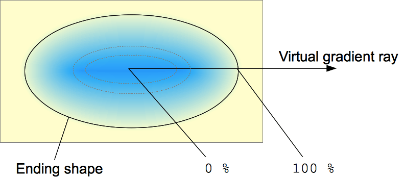
径向渐变由一个中心点、一个结束形状以及两个或多个色标点来定义。
为了创建平滑的渐变,radial-gradient() 函数会绘制一系列从中心向结束形状(并可能超出)辐射的同心形状。结束形状可以是圆形或椭圆形。
色标点位于一条从中心水平向右延伸的虚拟渐变射线上。基于百分比的色标位置是相对于结束形状与该渐变射线的交点来计算的,该交点代表 100%。每个形状都是单一的颜色,由它与渐变射线相交处的颜色决定。
正式语法
<radial-gradient()> =
  radial-gradient( [ <radial-gradient-syntax> ] )

<radial-gradient-syntax> =
  [ [ [ <radial-shape> || <radial-size> ]? [ at <position> ]? ] || <color-interpolation-method> ]? , <color-stop-list>

<radial-shape> =
  circle   |
  ellipse

<radial-size> =
  <radial-extent>               |
  <length [0,∞]>                |
  <length-percentage [0,∞]>{2}

<position> =
  <position-one>   |
  <position-two>   |
  <position-four>

<color-interpolation-method> =
  in [ <rectangular-color-space> | <polar-color-space> <hue-interpolation-method>? | <custom-color-space> ]

<color-stop-list> =
  <linear-color-stop> , [ <linear-color-hint>? , <linear-color-stop> ]#?

<radial-extent> =
  closest-corner   |
  closest-side     |
  farthest-corner  |
  farthest-side

<length-percentage> =
  <length>      |
  <percentage>

<position-one> =
  left                 |
  center               |
  right                |
  top                  |
  bottom               |
  x-start              |
  x-end                |
  y-start              |
  y-end                |
  block-start          |
  block-end            |
  inline-start         |
  inline-end           |
  <length-percentage>

<position-two> =
  [ left | center | right | x-start | x-end ] && [ top | center | bottom | y-start | y-end ]  |
  [ left | center | right | x-start | x-end | <length-percentage> ] [ top | center | bottom | y-start | y-end | <length-percentage> ]  |
  [ block-start | center | block-end ] && [ inline-start | center | inline-end ]  |
  [ start | center | end ]{2}

<position-four> =
  [ [ left | right | x-start | x-end ] <length-percentage> ] && [ [ top | bottom | y-start | y-end ] <length-percentage> ]  |
  [ [ block-start | block-end ] <length-percentage> ] && [ [ inline-start | inline-end ] <length-percentage> ]  |
  [ [ start | end ] <length-percentage> ]{2}

<rectangular-color-space> =
  srgb               |
  srgb-linear        |
  display-p3         |
  display-p3-linear  |
  a98-rgb            |
  prophoto-rgb       |
  rec2020            |
  lab                |
  oklab              |
  <xyz-space>

<polar-color-space> =
  hsl    |
  hwb    |
  lch    |
  oklch

<hue-interpolation-method> =
  [ shorter | longer | increasing | decreasing ] hue

<custom-color-space> =
  <dashed-ident>

<linear-color-stop> =
  <color> <color-stop-length>?

<linear-color-hint> =
  <length-percentage>

<xyz-space> =
  xyz      |
  xyz-d50  |
  xyz-d65

<color-stop-length> =
  <length-percentage>{1,2}
示例
基本渐变
.radial-gradient {
  background-image: radial-gradient(cyan 0%, transparent 20%, salmon 40%);
}
非居中渐变
.radial-gradient {
  background-image: radial-gradient(
    farthest-corner at 40px 40px,
    #ff3355 0%,
    #4433ee 100%
  );
}
色相插值
在这个插值示例中,使用了 hsl 颜色系统,并对色相进行了插值。
.shorter {
  background-image: radial-gradient(
    circle at center in hsl shorter hue,
    red,
    blue
  );
}

.longer {
  background-image: radial-gradient(
    circle at center in hsl longer hue,
    red,
    blue
  );
}
左边的框使用了较短插值法,这意味着颜色在色轮上沿较短的弧线直接从红色变为蓝色。右边的框使用了较长插值法,这意味着颜色沿较长的弧线从红色变为蓝色,途中经过了绿色、黄色和橙色。
更多径向渐变示例
请参阅使用 CSS 渐变了解更多示例。
规范
| 规范 |
|---|
| CSS 图像模块第三级 # 径向渐变 |
浏览器兼容性
加载中…