试一试
border-top-right-radius: 80px 80px;
border-top-right-radius: 250px 100px;
border-top-right-radius: 50%;
border-top-right-radius: 50%;
border: black 10px double;
background-clip: content-box;
<section class="default-example" id="default-example">
  <div class="transition-all" id="example-element">
    This is a box with a top right rounded corner.
  </div>
</section>
#example-element {
  width: 80%;
  height: 80%;
  display: flex;
  justify-content: center;
  flex-direction: column;
  background-color: #5b6dcd;
  color: white;
  padding: 10px;
}
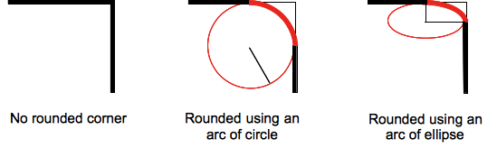
圆角可以是圆形或椭圆形,如果其中一个值为 0,则不进行圆角处理,角为直角。
背景(无论是图像还是颜色)都会在边框处被裁剪,即使是圆角边框也是如此;裁剪的确切位置由 background-clip 属性的值定义。
注意: 如果此属性的值在应用于元素且在 border-top-right-radius CSS 属性之后使用的 border-radius 简写属性中未设置,则此属性的值将被 简写属性 重置为其初始值。
语法
css
/* the corner is a circle */
/* border-top-right-radius: radius */
border-top-right-radius: 3px;

/* the corner is an ellipse */
/* border-top-right-radius: horizontal vertical */
border-top-right-radius: 0.5em 1em;

border-top-right-radius: inherit;

/* Global values */
border-top-right-radius: inherit;
border-top-right-radius: initial;
border-top-right-radius: revert;
border-top-right-radius: revert-layer;
border-top-right-radius: unset;
一个值时
- 该值是
<length>或<percentage>,表示该角边框使用的圆的半径。
两个值时
- 第一个值是
<length>或<percentage>,表示该角边框使用的椭圆的水平半长轴。 - 第二个值是
<length>或<percentage>,表示该角边框使用的椭圆的垂直半长轴。
值
<length-percentage>-
表示圆的半径或椭圆的半长轴和半短轴的大小。作为绝对长度,它可以表示为 CSS
<length>数据类型允许的任何单位。百分比值中,水平轴的百分比值参照框的宽度,垂直轴的百分比值参照框的高度。负值无效。
正式定义
| 初始值 | 0 |
|---|---|
| 应用于 | 所有元素;但当border-collapse为collapse时,用户代理不要求应用于table和inline-table元素。目前,内部表格元素的行为未定义。它也适用于::first-letter。 |
| 继承性 | 否 |
| 百分比 | 参考边框框的相应维度 |
| 计算值 | 两个绝对 <length> 或 <percentage> 值 |
| 动画类型 | 一个长度、百分比或 calc(); |
正式语法
border-top-right-radius =
  <length-percentage [0,∞]>{1,2}

<length-percentage> =
  <length>      |
  <percentage>
示例
圆弧
单个 <length> 值会产生圆弧。
css
div {
  border-top-right-radius: 40px;
  background-color: lightgreen;
  border: solid 1px black;
  width: 100px;
  height: 100px;
}
椭圆弧
两个不同的 <length> 值会产生椭圆弧。
css
div {
  border-top-right-radius: 40px 20px;
  background-color: lightgreen;
  border: solid 1px black;
  width: 100px;
  height: 100px;
}
带有百分比半径的正方形元素
带有单个 <percentage> 值的正方形元素会产生圆弧。
css
div {
  border-top-right-radius: 40%;
  background-color: lightgreen;
  border: solid 1px black;
  width: 100px;
  height: 100px;
}
带有百分比半径的非正方形元素
带有单个 <percentage> 值的非正方形元素会产生椭圆弧。
css
div {
  border-top-right-radius: 40%;
  background-color: lightgreen;
  border: solid 1px black;
  width: 200px;
  height: 100px;
}
规范
| 规范 |
|---|
| CSS Backgrounds and Borders Module Level 3 # border-radius |
浏览器兼容性
加载中…