从盒子值创建形状
创建形状的一种简单方法是使用 CSS 盒模型模块中的值。本文解释了如何做到这一点。
允许作为形状值的 <box-edge> 盒子值是
content-boxpadding-boxborder-boxmargin-box
还支持 border-radius 值。这意味着你可以给元素一个弯曲的边框,并让你的内容围绕创建的形状流动。
CSS 盒子模型
上面列出的值对应于 CSS 盒模型的各个部分。CSS 中的一个盒子有内容、内边距、边框和外边距。
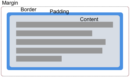
通过使用盒子值来创建形状,我们可以让内容围绕这些值定义的边缘环绕。在下面的每个示例中,我都使用了一个定义了内边距、边框和外边距的元素,以便你可以看到内容流动的不同方式。
margin-box
margin-box 是由外部外边距边缘定义的形状,如果元素定义中使用了 border-radius,则包括形状的圆角。
在下面的示例中,我们有一个紫色的圆形项,它是一个具有高度、宽度和背景色的 <div>。通过设置 border-radius: 50%,使用了 border-radius 属性来创建一个圆形。由于元素有外边距,你可以看到内容正在围绕圆形形状及其应用的外边距流动。
<div class="box">
  <div class="shape"></div>
  <p>
    One November night in the year 1782, so the story runs, two brothers sat
    over their winter fire in the little French town of Annonay, watching the
    grey smoke-wreaths from the hearth curl up the wide chimney. Their names
    were Stephen and Joseph Montgolfier, they were papermakers by trade, and
    were noted as possessing thoughtful minds and a deep interest in all
    scientific knowledge and new discovery.
  </p>
</div>
body {
  font: 1.2em sans-serif;
}

.shape {
  background-color: rebeccapurple;
  height: 80px;
  width: 80px;
  padding: 20px;
  margin: 20px;
  border: 10px solid black;
  border-radius: 50%;
  float: left;
  shape-outside: margin-box;
}
border-box
border-box 值是由外部边框边缘定义的形状。此形状遵循所有正常的边框半径塑形规则,用于边框的外部。即使你没有使用 CSS border 属性,你仍然有一个边框。在这种情况下,它将与 padding-box 相同,即由外部内边距边缘定义的形状。
在下面的示例中,你可以看到文本现在如何沿着边框创建的线条流动。更改边框大小,内容将随之改变。
body {
  font: 1.2em sans-serif;
}
.box {
  width: 70%;
}

.shape {
  background-color: rebeccapurple;
  height: 80px;
  width: 80px;
  padding: 20px;
  margin: 20px;
  border: 10px solid black;
  border-radius: 50%;
  float: left;
  shape-outside: border-box;
}
padding-box
padding-box 值定义了由外部内边距边缘包围的形状。此形状遵循所有正常的边框半径塑形规则,用于边框的内部。如果你没有内边距,那么 padding-box 与 content-box 相同。
body {
  font: 1.2em / 1.2 sans-serif;
}
.box {
  width: 70%;
}

.shape {
  background-color: rebeccapurple;
  height: 80px;
  width: 80px;
  padding: 20px;
  margin: 20px;
  border: 10px solid black;
  border-radius: 50%;
  float: left;
  shape-outside: padding-box;
}
content-box
content-box 值定义了由外部内容边缘包围的形状。此盒子的每个角半径都是 border-radius 减去 border-width 和 padding,或者 0,以较大者为准。这意味着此处不可能有负值。
body {
  font: 1.2em / 1.2 sans-serif;
}
.box {
  width: 70%;
}

.shape {
  background-color: rebeccapurple;
  height: 80px;
  width: 80px;
  padding: 20px;
  margin: 20px;
  border: 10px solid black;
  border-radius: 50%;
  float: left;
  shape-outside: content-box;
}
何时使用盒子值
使用盒子值是创建形状的一种方式;然而,这自然只适用于可以使用 border-radius 属性定义的非常基本的形状。上面显示的示例展示了这样一种用例。你可以使用 border-radius 创建一个圆形形状,然后让文本围绕它弯曲。
仅凭这种基本技术,你就可以创造一些有趣的效果。在本节的最后一个示例中,我将两个元素向左和向右浮动,并给每个元素在最靠近文本的方向上设置了 100% 的边框半径。
<div class="box">
  <div class="shape-left"></div>
  <div class="shape-right"></div>
  <p>
    One November night in the year 1782, so the story runs, two brothers sat
    over their winter fire in the little French town of Annonay, watching the
    grey smoke-wreaths from the hearth curl up the wide chimney. Their names
    were Stephen and Joseph Montgolfier, they were papermakers by trade, and
    were noted as possessing thoughtful minds and a deep interest in all
    scientific knowledge and new discovery.
  </p>
</div>
body {
  font: 1.2em / 1.5 sans-serif;
}

.box {
  text-align: justify;
}

.shape-left,
.shape-right {
  height: 100px;
  width: 100px;
}

.shape-left {
  margin: 0 20px 20px 0;
  border-bottom-right-radius: 100%;
  float: left;
  shape-outside: margin-box;
}
.shape-right {
  margin: 0 20px 20px;
  border-bottom-left-radius: 100%;
  float: right;
  shape-outside: margin-box;
}
对于更复杂的形状,你需要使用 基本形状之一作为值,或者从图像定义你的形状,如本节中的其他指南所述。