试一试
border-image-slice: 30;
border-image-slice: 30 fill;
border-image-slice: 44;
border-image: url("/shared-assets/images/examples/border-florid.svg") round;
border-image-slice: calc(50 / 184 * 100%) calc(80 / 284 * 100%) fill;
border-image-width: 30px 48px;
<section id="default-example">
  <div id="example-element">This is a box with a border around it.</div>
</section>
#example-element {
  width: 80%;
  height: 80%;
  display: flex;
  align-items: center;
  justify-content: center;
  padding: 50px;
  background: #fff3d4;
  color: black;
  border: 30px solid;
  border-image: url("/shared-assets/images/examples/border-diamonds.png") 30
    round;
  font-size: 1.2em;
}
切片过程总共创建九个区域:四个角、四个边和一个中间区域。四条切片线(与各自的边保持给定距离)控制着区域的大小。
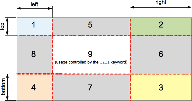
上图说明了每个区域的位置。
- 区域 1-4 是角区域。每个区域都只使用一次,以形成最终边框图像的角。
- 区域 5-8 是边缘区域。这些区域在最终的边框图像中被重复、缩放或以其他方式修改,以匹配元素的尺寸。
- 区域 9 是中间区域。默认情况下它被丢弃,但如果设置了关键字
fill,则像背景图像一样使用。
border-image-repeat、border-image-width 和 border-image-outset 属性决定了这些区域如何用于形成最终的边框图像。
语法
/* All sides */
border-image-slice: 30%;

/* top and bottom | left and right */
border-image-slice: 10% 30%;

/* top | left and right | bottom */
border-image-slice: 30 30% 45;

/* top | right | bottom | left */
border-image-slice: 7 12 14 5;

/* Using the `fill` keyword */
border-image-slice: 10% fill;
border-image-slice: fill 10%;

/* Global values */
border-image-slice: inherit;
border-image-slice: initial;
border-image-slice: revert;
border-image-slice: revert-layer;
border-image-slice: unset;
border-image-slice 属性可以使用一到四个 <number-percentage> 值来指定,表示每个图像切片的位置。负值无效;大于其对应维度的值将被限制为 100%。
- 当指定一个位置时,它会以相同距离从各自的边创建所有四个切片。
- 当指定两个位置时,第一个值创建从顶部和底部测量的切片,第二个值创建从左侧和右侧测量的切片。
- 当指定三个位置时,第一个值创建从顶部测量的切片,第二个值创建从左侧和右侧测量的切片,第三个值创建从底部测量的切片。
- 当指定四个位置时,它们按顺序(顺时针)创建从顶部、右侧、底部和左侧测量的切片。
可选的 fill 值(如果使用)可以放置在声明中的任何位置。
值
<number>-
表示光栅图像的像素边缘偏移量,以及矢量图像的坐标。对于矢量图像,该数字是相对于元素大小而不是源图像大小的,因此在这些情况下通常百分比更可取。
<percentage>-
表示边缘偏移量,以源图像大小的百分比表示:水平偏移量为图像宽度,垂直偏移量为图像高度。
fill-
保留中间图像区域并将其像背景图像一样显示,但堆叠在实际的
background之上。它的宽度和高度分别与顶部和左侧图像区域匹配。
正式定义
| 初始值 | 100% |
|---|---|
| 应用于 | 所有元素,但在 border-collapse 为 collapse 时,内部表格元素除外。该属性也适用于 ::first-letter。 |
| 继承性 | 否 |
| 百分比 | 指边框图像的大小 |
| 计算值 | 一到四个百分比(按指定)或绝对长度,如果指定了关键字 fill |
| 动画类型 | 按计算值类型 |
正式语法
border-image-slice =
  [ <number [0,∞]> | <percentage [0,∞]> ]{1,4}  &&
  fill?
示例
可调整的边框宽度和切片
以下示例显示了一个设置了边框图像的 <div>。边框的源图像如下:

菱形宽 30px,因此将 30 像素设置为 border-width 和 border-image-slice 的值将使您在边框中获得完整且相当清晰的菱形。
border-width: 30px;
border-image-slice: 30;
这些是我们在此示例中使用的默认值。但是,我们还提供了两个滑块,允许您动态更改上述两个属性的值,让您体会它们所产生的影响。
border-image-slice 更改用于每个边框和边框角(如果使用了 fill 关键字,则还用于内容区域)的图像切片的大小——将其从 30 调整会导致边框看起来有些不规则,但可能会产生一些有趣的效果。
border-width: 更改边框的宽度。采样图像大小会缩放以适应边框内部,这意味着如果宽度大于切片,图像可能会开始显得有些像素化(当然,除非您使用 SVG 图像)。
HTML
<div class="wrapper">
  <div></div>
</div>

<ul>
  <li>
    <label for="width">slide to adjust <code>border-width</code></label>
    <input type="range" min="10" max="45" id="width" />
    <output id="width-output">30px</output>
  </li>
  <li>
    <label for="slice">slide to adjust <code>border-image-slice</code></label>
    <input type="range" min="10" max="45" id="slice" />
    <output id="slice-output">30</output>
  </li>
</ul>
CSS
.wrapper {
  width: 400px;
  height: 300px;
}

div > div {
  width: 300px;
  height: 200px;
  border-width: 30px;
  border-style: solid;
  border-image: url("/shared-assets/images/examples/border-diamonds.png");
  border-image-slice: 30;
  border-image-repeat: round;
}

li {
  display: flex;
  place-content: center;
}
JavaScript
const widthSlider = document.getElementById("width");
const sliceSlider = document.getElementById("slice");
const widthOutput = document.getElementById("width-output");
const sliceOutput = document.getElementById("slice-output");
const divElem = document.querySelector("div > div");

widthSlider.addEventListener("input", () => {
  const newValue = `${widthSlider.value}px`;
  divElem.style.borderWidth = newValue;
  widthOutput.textContent = newValue;
});

sliceSlider.addEventListener("input", () => {
  const newValue = sliceSlider.value;
  divElem.style.borderImageSlice = newValue;
  sliceOutput.textContent = newValue;
});
结果
规范
| 规范 |
|---|
| CSS Backgrounds and Borders Module Level 3 # border-image-slice |
浏览器兼容性
加载中…
另见
- 1-到-4 值语法的图示说明
- MDN 博客上的《CSS 中的边框图像:Interop 2023 的一个重点关注领域》(2023 年)