linear-gradient()
Baseline 广泛可用 *
linear-gradient() CSS 函数用于创建一个由两种或多种颜色沿一条直线渐变构成的图像。其结果属于 <gradient> 数据类型,这是一种特殊的 <image>。
试一试
background: linear-gradient(#e66465, #9198e5);
background: linear-gradient(0.25turn, #3f87a6, #ebf8e1, #f69d3c);
background: linear-gradient(
  to left,
  #333333,
  #333333 50%,
  #eeeeee 75%,
  #333333 75%
);
background:
  linear-gradient(217deg, rgb(255 0 0 / 0.8), transparent 70.71%),
  linear-gradient(127deg, rgb(0 255 0 / 0.8), transparent 70.71%),
  linear-gradient(336deg, rgb(0 0 255 / 0.8), transparent 70.71%);
<section class="display-block" id="default-example">
  <div id="example-element"></div>
</section>
#example-element {
  min-height: 100%;
}
语法
/* A gradient with a single color of red */
linear-gradient(red)

/* A gradient tilted 45 degrees,
   starting blue and finishing red */
linear-gradient(45deg, blue, red)

/* A gradient going from the bottom right to the top left corner,
   starting blue and finishing red */
linear-gradient(to left top, blue, red)

/* Interpolation in rectangular color space */
linear-gradient(in oklab, blue, red)

/* Interpolation in polar color space */
linear-gradient(in hsl, blue, red)

/* Interpolation in polar color space
  with longer hue interpolation method */
linear-gradient(in hsl longer hue, blue, red)

/* Color stop: A gradient going from the bottom to top,
   starting blue, turning green at 40% of its length,
   and finishing red */
linear-gradient(0deg, blue, green 40%, red)

/* Color hint: A gradient going from the left to right,
   starting red, getting to the midpoint color
   10% of the way across the length of the gradient,
   taking the rest of the 90% of the length to change to blue */
linear-gradient(.25turn, red, 10%, blue)

/* Multi-position color stop: A gradient tilted 45 degrees,
   with a red bottom-left half and a blue top-right half,
   with a hard line where the gradient changes from red to blue */
linear-gradient(45deg, red 0 50%, blue 50% 100%)
值
<side-or-corner>-
渐变线的起始点位置。如果指定,它由
to加上最多两个关键字组成:一个表示水平方向(left或right),另一个表示垂直方向(top或bottom)。方向关键字的顺序无关紧要。如果未指定,则默认为to bottom。to top、to bottom、to left和to right的值分别等同于0deg、180deg、270deg和90deg。其他值会被转换成一个角度。 <angle>-
渐变线的方向角度。
0deg等同于to top;增加值会从此开始顺时针旋转。 <linear-color-stop>-
色标的
<color>值,后面可以跟一个或两个可选的位置(每个位置可以是沿渐变轴的<percentage>或<length>)。 <color-hint>-
一个插值提示,用于定义渐变在相邻色标之间的过渡方式。该长度定义了在两个色标之间的哪个点,渐变色应达到颜色过渡的中点。如果省略,颜色过渡的中点将是两个色标之间的中点。
描述
与任何渐变一样,线性渐变没有内在尺寸;也就是说,它没有自然或首选的大小,也没有首选的比例。它的具体大小将与应用它的元素的大小相匹配。
要创建重复填充其容器的线性渐变,请改用 repeating-linear-gradient() 函数。
由于 <gradient> 属于 <image> 数据类型,因此它们只能在可以使用 <image> 的地方使用。因此,linear-gradient() 不适用于 background-color 以及其他使用 <color> 数据类型的属性。
线性渐变的构成
线性渐变由一个轴(渐变线)和两个或多个色标点定义。轴上的每个点都是一种不同的颜色;为了创建平滑的渐变,linear-gradient() 函数会绘制一系列垂直于渐变线的彩色线条,每条线的颜色都与它和渐变线相交点的颜色相匹配。
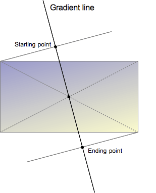
渐变线由包含渐变图像的盒子的中心和一个角度定义。渐变的颜色由两个或多个点决定:起始点、结束点以及介于两者之间的可选色标点。
起始点是渐变线上第一种颜色开始的位置。结束点是最后一种颜色结束的位置。这两个点都是由渐变线与一条穿过同象限盒子角落的垂直线的交点定义的。结束点可以理解为起始点的对称点。这些有些复杂的定义导致了一个有趣的效果,有时被称为魔术角:最接近起始点和结束点的角落与它们各自的起始点或结束点具有相同的颜色。
自定义渐变
通过在渐变线上添加更多的色标点,你可以在多种颜色之间创建高度定制的过渡。色标的位置可以通过使用 <length> 或 <percentage> 来明确定义。如果你没有指定一个颜色的位置,它会被放置在它前面和后面的颜色之间的中间位置。以下两个渐变是等效的。
linear-gradient(red, orange, yellow, green, blue);
linear-gradient(red 0%, orange 25%, yellow 50%, green 75%, blue 100%);
默认情况下,颜色从一个色标的颜色平滑地过渡到下一个色标的颜色,颜色之间的中点是颜色过渡的中间点。你可以通过在两种颜色之间添加一个未标记的 % 颜色提示,将这个中点移动到两个色标之间的任何位置,以指示颜色过渡的中间应该在哪里。以下示例从开始到 10% 标记处为纯红色,从 90% 到结束为纯蓝色。在 10% 和 90% 之间,颜色从红色过渡到蓝色,但是过渡的中点在 30% 标记处,而不是在没有 30% 颜色提示的情况下会发生的 50%。
linear-gradient(red 10%, 30%, blue 90%);
如果两个或多个色标位于相同位置,过渡将是在该位置声明的第一个和最后一个颜色之间的硬线。
色标应按升序排列。后面值较小的色标将覆盖前一个色标的值,从而产生硬过渡。以下示例在 40% 标记处从红色变为黄色,然后在渐变的 25% 范围内从黄色过渡到蓝色。
linear-gradient(red 40%, yellow 30%, blue 65%);
允许多位置色标。一种颜色可以声明为两个相邻的色标,方法是在 CSS 声明中包含两个位置。以下三个渐变是等效的。
linear-gradient(red 0%, orange 10%, orange 30%, yellow 50%, yellow 70%, green 90%, green 100%);
linear-gradient(red, orange 10% 30%, yellow 50% 70%, green 90%);
linear-gradient(red 0%, orange 10% 30%, yellow 50% 70%, green 90% 100%);
默认情况下,如果没有颜色在 0% 停止,声明的第一个颜色将位于该点。同样,最后一个颜色将持续到 100% 标记,或者如果最后一个停止点没有声明长度,则位于 100% 标记处。
正式语法
<linear-gradient()> =
  linear-gradient( [ <linear-gradient-syntax> ] )

<linear-gradient-syntax> =
  [ [ <angle> | <zero> | to <side-or-corner> ] || <color-interpolation-method> ]? , <color-stop-list>

<side-or-corner> =
  [ left | right ]  ||
  [ top | bottom ]

<color-interpolation-method> =
  in [ <rectangular-color-space> | <polar-color-space> <hue-interpolation-method>? | <custom-color-space> ]

<color-stop-list> =
  <linear-color-stop> , [ <linear-color-hint>? , <linear-color-stop> ]#?

<rectangular-color-space> =
  srgb               |
  srgb-linear        |
  display-p3         |
  display-p3-linear  |
  a98-rgb            |
  prophoto-rgb       |
  rec2020            |
  lab                |
  oklab              |
  <xyz-space>

<polar-color-space> =
  hsl    |
  hwb    |
  lch    |
  oklch

<hue-interpolation-method> =
  [ shorter | longer | increasing | decreasing ] hue

<custom-color-space> =
  <dashed-ident>

<linear-color-stop> =
  <color> <color-stop-length>?

<linear-color-hint> =
  <length-percentage>

<xyz-space> =
  xyz      |
  xyz-d50  |
  xyz-d65

<color-stop-length> =
  <length-percentage>{1,2}

<length-percentage> =
  <length>      |
  <percentage>
示例
45 度角的渐变
body {
  background: linear-gradient(45deg, red, blue);
}
从渐变线 60% 处开始的渐变
body {
  background: linear-gradient(135deg, orange 60%, cyan);
}
矩形颜色空间中的插值
body {
  background: linear-gradient(90deg in oklab, blue, red);
}
色相插值
在这个插值示例中,使用了 hsl 颜色系统,并对色相进行了插值。
.shorter {
  background: linear-gradient(90deg in hsl shorter hue, red, blue);
}

.longer {
  background: linear-gradient(90deg in hsl longer hue, red, blue);
}
顶部的盒子使用较短插值,意味着颜色使用色轮上的较短弧线直接从红色变为蓝色。底部的盒子使用较长插值,意味着颜色使用较长弧线从红色变为蓝色,经过绿色、黄色和橙色。
带有多位置色标的渐变
此示例使用多位置色标,相邻颜色具有相同的色标值,从而创建条纹效果。
body {
  background: linear-gradient(
    to right,
    red 20%,
    orange 20% 40%,
    yellow 40% 60%,
    green 60% 80%,
    blue 80%
  );
}
更多 linear-gradient 示例
请参阅使用 CSS 渐变以获取更多示例。
规范
| 规范 |
|---|
| CSS 图像模块第 4 级 # 线性渐变 |
浏览器兼容性
加载中…