offset-path
Baseline 广泛可用 *
offset-path CSS 属性指定一个供元素跟随的路径,并决定该元素在其父容器或 SVG 坐标系中的位置。这个路径可以是直线、曲线或几何图形,元素将沿着它定位或移动。
offset-path 属性与 offset-distance、offset-rotate 和 offset-anchor 属性结合使用,以控制元素沿路径的位置和方向。
试一试
offset-path: path("M-70,-40 C-70,70 70,70 70,-40");
offset-path: path("M0,0 L60,70 L-60,30z");
<section class="default-example" id="default-example">
  <div class="transition-all" id="example-element"></div>
  <button id="playback" type="button">Play</button>
</section>
#example-element {
  width: 24px;
  height: 24px;
  background: #2bc4a2;
  animation: distance 8000ms infinite linear;
  animation-play-state: paused;
  clip-path: polygon(0% 0%, 70% 0%, 100% 50%, 70% 100%, 0% 100%, 30% 50%);
}

#example-element.running {
  animation-play-state: running;
}

#playback {
  position: absolute;
  top: 0;
  left: 0;
  font-size: 1em;
}

@keyframes distance {
  0% {
    offset-distance: 0%;
  }
  100% {
    offset-distance: 100%;
  }
}

#default-example {
  position: relative;
}
const example = document.getElementById("example-element");
const button = document.getElementById("playback");

button.addEventListener("click", () => {
  if (example.classList.contains("running")) {
    example.classList.remove("running");
    button.textContent = "Play";
  } else {
    example.classList.add("running");
    button.textContent = "Pause";
  }
});
语法
/* Default */
offset-path: none;

/* Line segment */
offset-path: ray(45deg closest-side contain);
offset-path: ray(contain 150deg at center center);
offset-path: ray(45deg);

/* URL */
offset-path: url("#my-circle");

/* Basic shape */
offset-path: circle(50% at 25% 25%);
offset-path: ellipse(50% 50% at 25% 25%);
offset-path: inset(50% 50% 50% 50%);
offset-path: polygon(30% 0%, 70% 0%, 100% 50%, 30% 100%, 0% 70%, 0% 30%);
offset-path: path("M 0,200 Q 200,200 260,80 Q 290,20 400,0 Q 300,100 400,200");
offset-path: rect(5px 5px 160px 145px round 20%);
offset-path: xywh(0 5px 100% 75% round 15% 0);

/* Coordinate box */
offset-path: content-box;
offset-path: padding-box;
offset-path: border-box;
offset-path: fill-box;
offset-path: stroke-box;
offset-path: view-box;

/* Global values */
offset-path: inherit;
offset-path: initial;
offset-path: revert;
offset-path: revert-layer;
offset-path: unset;
值
offset-path 属性接受 <offset-path> 值、<coord-box> 值或两者,或 none 关键字。<offset-path> 值可以是 ray() 函数、<url> 值或 <basic-shape> 值。
none-
指定元素不遵循任何偏移路径。
none值等同于元素没有任何偏移变换。在这种情况下,元素的移动由其默认的位置属性(如top和left)决定,而不是偏移路径。这是默认值。 <offset-path>-
一个
ray()函数、<url>值或<basic-shape>值,用于指定几何偏移路径。如果省略,<coord-box>值的路径形状为inset(0 round X),其中X是建立包含块的元素的border-radius值。ray()-
定义一条从设定位置开始、具有设定长度、并以指定角度延伸的线。
ray()函数最多接受四个参数——一个<angle>、一个可选的大小值、可选的关键字contain和一个可选的at <position>。 <url>-
指定一个 SVG 形状元素的 ID。该路径是
url()函数中通过id引用的 SVG<circle>、<ellipse>、<line>、<path>、<polygon>、<polyline>或<rect>元素的形状。如果 URL 没有引用形状元素或因其他原因无效,则偏移路径的解析值为path("M0,0")(这是一个有效的<basic-shape>值)。 <basic-shape>-
将偏移路径指定为一个 CSS 基本形状函数的等效路径,例如
circle()、ellipse()、inset()、path()、polygon()、rect()或xywh()。例如,如果<basic_shape>是一个ellipse()函数,则路径是椭圆的轮廓,从椭圆的最右点开始,顺时针旋转一整圈。对于接受at <position>参数的ellipse()和circle(),如果省略了<position>,则位置默认为center,除非元素指定了offset-position。在这种情况下,offset-position的值将用作at <position>参数。可以使用shape()函数定义更复杂的形状。
<coord-box>-
指定包含路径的参考盒的大小信息。参考盒派生自为此元素建立包含块的元素。此参数是可选的。如果未指定,在 CSS 上下文中默认值为
border-box。在 SVG 上下文中,该值被视为view-box。如果使用ray()或<basic-shape>定义偏移路径,<coord-box>值分别为射线或<basic-shape>提供参考盒。如果使用<url>定义偏移路径,<coord-box>值为形状元素提供了视口和用户坐标系,其原点 (0 0) 在左上角,大小为1px。
描述
offset-path 属性定义了动画元素可以遵循的路径。偏移路径可以是一个带有一个或多个子路径的指定路径,也可以是一个未设置样式的基本几何形状。元素在偏移路径上的确切位置由 offset-distance 属性决定。每个形状或路径必须为 offset-distance 计算值为 0 的情况定义一个初始位置,并为对象在初始位置的旋转方向定义一个初始方向。
早期版本的规范将此属性称为 motion-path。后来改为 offset-path,因为该属性描述的是静态位置,而非运动。
正式定义
正式语法
offset-path =
  none                          |
  <offset-path> || <coord-box>

<offset-path> =
  <ray()>        |
  <url>          |
  <basic-shape>

<coord-box> =
  <paint-box>  |
  view-box

<ray()> =
  ray( <angle>          &&
  <ray-size>?           &&
  contain?              &&
  [ at <position> ]? )

<paint-box> =
  <visual-box>  |
  fill-box      |
  stroke-box

<ray-size> =
  closest-side     |
  closest-corner   |
  farthest-side    |
  farthest-corner  |
  sides

<position> =
  <position-one>   |
  <position-two>   |
  <position-four>

<visual-box> =
  content-box  |
  padding-box  |
  border-box

<position-one> =
  left                 |
  center               |
  right                |
  top                  |
  bottom               |
  x-start              |
  x-end                |
  y-start              |
  y-end                |
  block-start          |
  block-end            |
  inline-start         |
  inline-end           |
  <length-percentage>

<position-two> =
  [ left | center | right | x-start | x-end ] && [ top | center | bottom | y-start | y-end ]  |
  [ left | center | right | x-start | x-end | <length-percentage> ] [ top | center | bottom | y-start | y-end | <length-percentage> ]  |
  [ block-start | center | block-end ] && [ inline-start | center | inline-end ]  |
  [ start | center | end ]{2}

<position-four> =
  [ [ left | right | x-start | x-end ] <length-percentage> ] && [ [ top | bottom | y-start | y-end ] <length-percentage> ]  |
  [ [ block-start | block-end ] <length-percentage> ] && [ [ inline-start | inline-end ] <length-percentage> ]  |
  [ [ start | end ] <length-percentage> ]{2}

<length-percentage> =
  <length>      |
  <percentage>
示例
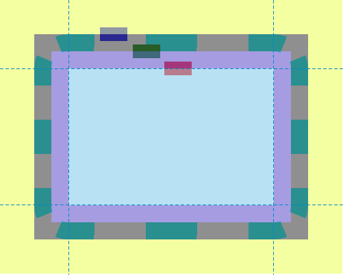
使用盒模型边缘定位创建 offset-path
此示例演示了在 offset-path 属性中使用各种 <coord-box> 值。
.box {
  width: 40px;
  height: 20px;
  animation: move 8000ms infinite ease-in-out;
}

.blueBox {
  background-color: blue;
  offset-path: border-box;
  offset-distance: 5%;
}

.greenBox {
  background-color: green;
  offset-path: padding-box;
  offset-distance: 8%;
}

.redBox {
  background-color: red;
  offset-path: content-box;
  offset-distance: 12%;
}

@keyframes move {
  0%,
  20% {
    offset-distance: 0%;
  }
  80%,
  100% {
    offset-distance: 100%;
  }
}
在这个示例中,外边距、边框和内边距被有意地设置了较大的值,以演示蓝色、绿色和红色矩形在它们各自的 <coord-box> 边缘(border-box、padding-box 和 content-box)上的位置。
结果
使用 path() 创建 offset-path
在此示例中,<svg> 元素创建了一个带烟囱的房子,并定义了一把剪刀的两半。房子和烟囱由矩形和多边形组成,剪刀的两半由两个不同的 path 元素表示。在 CSS 代码中,offset-path 属性用于为剪刀的两半指定要遵循的路径。这个 CSS 定义的路径与 SVG 中 <path> 元素表示的路径相同,即房子的轮廓,包括烟囱。
<svg
  xmlns="http://www.w3.org/2000/svg"
  width="700"
  height="450"
  viewBox="350 0 1400 900">
  <title>House and Scissors</title>
  <rect x="595" y="423" width="610" height="377" fill="blue" />
  <polygon points="506,423 900,190 1294,423" fill="yellow" />
  <polygon points="993,245 993,190 1086,190 1086,300" fill="red" />
  <path
    id="house"
    d="M900,190 L993,245 V201 A11,11 0 0,1 1004,190 H1075 A11,11 0 0,1 1086,201 V300 L1294,423 H1216 A11,11 0 0,0 1205,434 V789 A11,11 0 0,1 1194,800 H606 A11,11 0 0,1 595,789 V434 A11,11 0 0,0 584,423 H506 L900,190"
    fill="none"
    stroke="black"
    stroke-width="13"
    stroke-linejoin="round"
    stroke-linecap="round" />
  <path
    id="first-scissor-half"
    class="scissor-half"
    d="M30,0 H-10 A10,10 0 0,0 -20,10 A20,20 0 1,1 -40,-10 H20 A10,10 0 0,1 30,0 M-40,20 A10,10 1 0,0 -40,0 A10,10 1 0,0 -40,20 M0,0" />
  <path
    id="second-scissor-half"
    class="scissor-half"
    d="M30,0 H-10 A10,10 0 0,1 -20,-10 A20,20 0 1,0 -40,10 H20 A10,10 0 0,0 30,0 M-40,-20 A10,10 1 0,0 -40,0 A10,10 1 0,0 -40,-20 M0,0" />
</svg>
.scissor-half {
  offset-path: path(
    "M900,190 L993,245 V201 A11,11 0 0,1 1004,190 H1075 A11,11 0 0,1 1086,201 V300 L1294,423 H1216 A11,11 0 0,0 1205,434 V789 A11,11 0 0,1 1194,800 H606 A11,11 0 0,1 595,789 V434 A11,11 0 0,0 584,423 H506 L900,190"
  );
  transform: translate(0px, 0px);
  fill: green;
  stroke: black;
  stroke-width: 5px;
  stroke-linejoin: round;
  stroke-linecap: round;
  fill-rule: evenodd;
  offset-anchor: 0 0;
}

#first-scissor-half {
  animation:
    move 12s linear infinite,
    rotate-left 1s infinite;
}
#second-scissor-half {
  animation:
    move 12s linear infinite,
    rotate-right 1s infinite;
}

@keyframes move {
  from {
    offset-distance: 0%;
  }
  to {
    offset-distance: 100%;
  }
}

@keyframes rotate-left {
  0% {
    offset-rotate: auto 0deg;
  }
  50% {
    offset-rotate: auto -45deg;
  }
  100% {
    offset-rotate: auto 0deg;
  }
}

@keyframes rotate-right {
  0% {
    offset-rotate: auto 0deg;
  }
  50% {
    offset-rotate: auto 45deg;
  }
  100% {
    offset-rotate: auto 0deg;
  }
}
结果
如果没有 offset-path 属性,剪刀的两半将默认位于画布的左上角。然而,通过使用 offset-path,剪刀的两半与 SVG 路径的起点对齐,从而可以沿着它移动。
使用 url() 创建 offset-path
此示例说明了如何引用 SVG 形状来定义元素可以遵循的路径形状。绿色圆圈(由 .target 定义)遵循一个矩形的路径,该路径是通过使用 url() 将 SVG 形状的 ID(svgRect)传递给 offset-path 属性来定义的。
此处显示的定义路径形状的 SVG 矩形仅用于直观地演示绿色圆圈确实在沿着此矩形定义的路径移动。
<div class="outer">
  <div class="target"></div>
</div>
<svg width="400" height="200" xmlns="http://www.w3.org/2000/svg">
  <rect id="svgRect" x="50" y="50" width="200" height="100" />
</svg>
.target {
  width: 50px;
  height: 50px;
  border-radius: 50%;
  background-color: green;
  offset-path: url("#svgRect");
  offset-anchor: auto;
  animation: move 5s linear infinite;
}

#svgRect {
  fill: antiquewhite;
  stroke: black;
  stroke-width: 2;
}

@keyframes move {
  0% {
    offset-distance: 0%;
  }
  100% {
    offset-distance: 100%;
  }
}
不同的形状
此示例涉及不同的 <basic-shape> 值:circle()、ellipse()、inset()、polygon()。
<div class="container">
  <div class="mover mover-path">path()</div>
  <div class="mover mover-circle">circle()</div>
  <div class="mover mover-ellipse">ellipse()</div>
  <div class="mover mover-inset">inset()</div>
  <div class="mover mover-polygon">polygon()</div>
</div>
.container {
  border: 1px solid black;
  width: 80vw;
  height: 80vh;
  position: relative;
  left: 10vw;
  top: 10vh;
}

.mover {
  width: 100px;
  height: 80px;
  border-radius: 50%;
  line-height: 80px;
  text-indent: 10px;
  background: url("data:image/svg+xml,%3Csvg xmlns='http://www.w3.org/2000/svg' id='e644da42-a34e-4ceb-a89a-89a4eb6dcc51' data-name='Layer 1' viewBox='0 0 71.08 54.62'%3E%3Ctitle%3Epointer-hand%3C/title%3E%3Cpath d='M43.56,49.35a5.24,5.24,0,0,0-1.27-3.43,5.26,5.26,0,0,0,1.86-9,5.26,5.26,0,0,0-.5-9.53L66.12,27c2.28-.07,5-1.57,5-4.58a5.06,5.06,0,0,0-4.58-4.83L34.08,17c3.48-2.89,6.26-6.55,6.73-11.08C41.45-.14,36.07-1.15,35,1.09,32,7.11,23,12.75,17.42,15.52,8.64,19.08,0,19.77,0,34.56,0,42.7,2.7,47.94,9.42,51c5.51,2.52,13.71,3.59,25.36,3.59H38.3A5.27,5.27,0,0,0,43.56,49.35Z'/%3E%3C/svg%3E")
    no-repeat;
  background-size: cover;
  color: white;
  animation: move 10s linear infinite;
  font-family: monospace;
  position: absolute;
  left: 50%;
  transform: translateX(-50%);
  transform-origin: center center;
}
.mover-path {
  top: 50px;
  motion-path: path(
    "M18.45,58.46s52.87-70.07,101.25-.75,101.75-6.23,101.75-6.23S246.38,5.59,165.33,9.08s-15,71.57-94.51,74.56S18.45,58.46,18.45,58.46Z"
  );
  offset-path: path(
    "M18.45,58.46s52.87-70.07,101.25-.75,101.75-6.23,101.75-6.23S246.38,5.59,165.33,9.08s-15,71.57-94.51,74.56S18.45,58.46,18.45,58.46Z"
  );
}
.mover-circle {
  top: 150px;
  offset-path: circle(100px at 50px 50px);
  motion-path: circle(100px at 50px 50px);
}
.mover-ellipse {
  top: 250px;
  offset-path: ellipse(25% 40% at 50% 50%);
  motion-path: ellipse(25% 40% at 50% 50%);
}
.mover-inset {
  top: 350px;
  offset-path: inset(5% 20% 15% 10%);
  motion-path: inset(5% 20% 15% 10%);
}
.mover-polygon {
  top: 450px;
  offset-path: polygon(
    30% 0%,
    70% 0%,
    100% 30%,
    100% 70%,
    70% 100%,
    30% 100%,
    0% 70%,
    0% 30%
  );
  motion-path: polygon(
    30% 0%,
    70% 0%,
    100% 30%,
    100% 70%,
    70% 100%,
    30% 100%,
    0% 70%,
    0% 30%
  );
}

@keyframes move {
  100% {
    motion-offset: 100%;
    offset-distance: 100%;
  }
}
规范
| 规范 |
|---|
| Motion Path Module Level 1 # offset-path 属性 |
浏览器兼容性
加载中…