使用 shape-outside 定义基本形状
CSS 形状可以使用 <basic-shape> 类型来定义。在本指南中,我们将讨论如何使用 shape-outside 属性创建矩形、圆形、椭圆和多边形。这些是在 CSS 形状模块中定义的特性。
在了解形状之前,有必要先了解两个使这些形状成为可能的信息:
<basic-shape>类型- 参考盒
<basic-shape> 类型
<basic-shape> 类型用作我们所有基本形状的值。此类型是一种函数表示法:函数括号中包含用于描述形状的参数。
可接受的参数因你创建的形状而异。我们将在下面的示例中介绍这些参数。
参考盒
在使用基本形状时,理解 CSS 形状所使用的参考盒非常重要,因为它定义了每个形状的坐标系。你已经在《通过盒模型值创建形状》指南中接触过参考盒,该指南直接使用参考盒来创建形状。
下面的截图显示了 Firefox 形状检查器,它展示了一个使用 shape-outside: circle(50%) 创建的圆形的参考盒。该元素应用了 20 像素的内边距、边框和外边距。形状检查器会高亮显示这些参考盒。
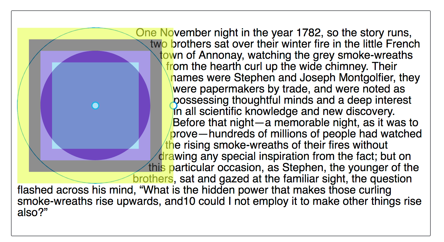
基本形状的默认参考盒是 margin-box。你可以从截图中看到,形状是相对于盒模型的该部分定义的。
虽然默认的参考盒是 margin-box,但可以修改。要设置一个不同的盒作为参考盒,请在你的基本形状定义之后加上所需的盒值。
这两个声明是相同的:
shape-outside: circle(50%);
shape-outside: circle(50%) margin-box;
要让你的形状使用不同的参考盒,请包含一个不同的 <box-edge> 值,例如,要使用边框作为我们圆形的参考盒,请设置为:
.shape {
  shape-outside: circle(50%) border-box;
}
创建的形状如果超出外边距盒,将被裁剪到外边距盒。下面的基本形状演示了这一点。
inset()
inset() 函数定义一个矩形。这看起来可能不太有用,因为浮动一个项目而不使用形状,也会在它周围形成一个矩形。然而,inset() 类型允许定义偏移量,从而将环绕的文本拉到缩小后的矩形周围,覆盖在浮动元素的部分区域上。
inset() 函数最多接受四个边偏移值,外加一个可选的 round 关键字,后跟一个 border-radius 值。下面的 CSS 创建了一个矩形形状,它从浮动元素的参考盒向内偏移,上下各 20 像素,左右各 10 像素,并且 border-radius 值为 10 像素。
.shape {
  float: left;
  shape-outside: inset(20px 10px 20px 10px round 10px);
}
偏移值的规则与 margin 简写相同。四个以空格分隔的值按顺序定义上、右、下、左的偏移量。你也可以一次设置多个偏移量:
- 如果只有一个值,它将应用于所有边。
- 如果有两个值,则第一个值设置上下偏移,第二个值设置左右偏移。
- 如果有三个值,则第一个值设置上偏移,第二个值设置左右偏移,第三个值设置下偏移。
因此,上述规则也可以写成:
.shape {
  float: left;
  shape-outside: inset(20px 10px round 10px);
}
在下面的示例中,我们使用一个 inset() 形状将内容拉到浮动元素上。改变偏移值,看看形状如何变化。
<div class="box">
  <div class="shape"></div>
  <p>
    One November night in the year 1782, so the story runs, two brothers sat
    over their winter fire in the little French town of Annonay, watching the
    grey smoke-wreaths from the hearth curl up the wide chimney. Their names
    were Stephen and Joseph Montgolfier, they were papermakers by trade, and
    were noted as possessing thoughtful minds and a deep interest in all
    scientific knowledge and new discovery. Before that night—a memorable night,
    as it was to prove—hundreds of millions of people had watched the rising
    smoke-wreaths of their fires without drawing any special inspiration from
    the fact.
  </p>
</div>
body {
  font: 1.2em sans-serif;
}

.shape {
  float: left;
  width: 150px;
  height: 100px;
  shape-outside: inset(20px 50px 10px 0 round 50px);
  background-color: rebeccapurple;
  border: 2px solid black;
  border-radius: 10px;
  margin: 20px;
  padding: 20px;
}
你还可以添加一个盒值作为备用参考盒。在下面的示例中,尝试将参考盒从 margin-box 更改为 border-box、padding-box 或 content-box,看看在计算偏移量之前,作为起点的参考盒如何变化。
body {
font: 1.2em sans-serif;
}
.shape {
float: left;
width: 150px;
height: 100px;
shape-outside: inset(20px 50px 10px 0 round 50px) margin-box;
background-color: rebeccapurple;
border: 2px solid black;
border-radius: 10px;
margin: 20px;
padding: 20px;
}
你还可以使用 rect() 函数根据与参考盒上边缘和左边缘的距离来创建矩形,或者使用 xywh() 函数根据宽度和高度来创建矩形;这两种函数都支持可选的圆角。
circle()
shape-outside 的 circle() 值可以接受两个可能的参数:一个定义大小的 <shape-radius> 和一个定义其位置的 <position>。
circle() 和 ellipse() 的 shape-outside 值都接受 <shape-radius> 作为参数。这可以是一个 <length>、一个 <percentage>,或者关键字 closest-side 或 farthest-side 之一。
关键字 closest-side 使用从形状中心到参考盒最近边的长度来创建半径长度。关键字 farthest-side 使用从形状中心到参考盒最远边的长度。
第二个参数是 position,它接受一个或两个关键字的 <position> 值,用于指示圆心的位置。其指定方式与 background-position 相同;如果省略一个或两个值,则默认值为 center。
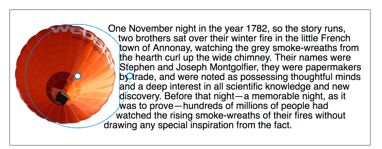
要创建一个圆形,我们包含一个半径值,后面可以跟一个关键字 at 和一个位置值。这个例子将圆形应用于一个 width 和 height 为 210px、margin 为 20px 的 <img>。这使得参考盒的总宽度为 250px。<shape-radius> 的 50% 值意味着半径为 125px。位置值设置为 30%,即距离左边 30%,且垂直方向位于默认的 center。
<div class="box">
<img
alt="An orange hot air balloon as seen from below"
src="https://mdn.github.io/shared-assets/images/examples/round-balloon.png" />
<p>
One November night in the year 1782, so the story runs, two brothers sat
over their winter fire in the little French town of Annonay, watching the
grey smoke-wreaths from the hearth curl up the wide chimney. Their names
were Stephen and Joseph Montgolfier, they were papermakers by trade, and
were noted as possessing thoughtful minds and a deep interest in all
scientific knowledge and new discovery. Before that night—a memorable night,
as it was to prove—hundreds of millions of people had watched the rising
smoke-wreaths of their fires without drawing any special inspiration from
the fact.
</p>
</div>
body {
font: 1.2em sans-serif;
}
img {
float: left;
shape-outside: circle(50% at 30%);
margin: 20px;
}
通过改变半径大小来增大或减小圆形,使用位置值移动圆形,或者像我们对 inset() 那样设置一个参考盒来玩一下。
下面的示例将生成的内容与一个 circle() 函数结合起来,该函数使用关键字 top left 作为位置。这在页面的左上角创建了一个四分之一圆的形状,供文本环绕。
<div class="box">
<p>
One November night in the year 1782, so the story runs, two brothers sat
over their winter fire in the little French town of Annonay, watching the
grey smoke-wreaths from the hearth curl up the wide chimney. Their names
were Stephen and Joseph Montgolfier, they were papermakers by trade, and
were noted as possessing thoughtful minds and a deep interest in all
scientific knowledge and new discovery. Before that night—a memorable night,
as it was to prove—hundreds of millions of people had watched the rising
smoke-wreaths of their fires without drawing any special inspiration from
the fact.
</p>
</div>
body {
font: 1.2em sans-serif;
}
.box::before {
content: "";
float: left;
width: 250px;
height: 250px;
shape-outside: circle(50% at top left);
}
形状将被外边距盒裁剪
如上文参考盒部分所述,margin-box 会裁剪形状。你可以通过将圆心位置设置为 60%,使其向内容方向移动来观察到这一点。圆心将更靠近内容,圆形会延伸到 margin-box 之外。这意味着延伸的部分会被裁剪并变成方形。
img {
float: left;
shape-outside: circle(50% at 60%);
}
ellipse()
椭圆是一个被压扁的圆。因此,ellipse() 函数的作用与 circle() 非常相似,只是我们必须按顺序指定两个半径:x 和 y。
然后,这些半径后面可以跟一个或两个 <position> 值,就像 circle() 一样,用来定义椭圆中心的位置。在下面的示例中,我们有一个 x 半径为 40%、y 半径为 50% 且 <position> 设置为 left 的椭圆。这意味着椭圆的中心位于参考盒左边缘的中心。这创建了一个半椭圆形状,文本将围绕其环绕。你可以改变这些值,看看椭圆如何变化。
<div class="box">
  <div class="shape"></div>
  <p>
    One November night in the year 1782, so the story runs, two brothers sat
    over their winter fire in the little French town of Annonay, watching the
    grey smoke-wreaths from the hearth curl up the wide chimney. Their names
    were Stephen and Joseph Montgolfier, they were papermakers by trade, and
    were noted as possessing thoughtful minds and a deep interest in all
    scientific knowledge and new discovery. Before that night—a memorable night,
    as it was to prove—hundreds of millions of people had watched the rising
    smoke-wreaths of their fires without drawing any special inspiration from
    the fact.
  </p>
</div>
body {
  font: 1.2em sans-serif;
}
.shape {
  float: left;
  shape-outside: ellipse(40% 50% at left);
  margin: 20px;
  width: 100px;
  height: 200px;
}
关键字 closest-side 和 farthest-side 对于根据浮动元素参考盒的大小快速创建椭圆非常有用。
body {
  font: 1.2em sans-serif;
}

.shape {
  float: left;
  shape-outside: ellipse(closest-side farthest-side at 30%);
  margin: 20px;
  width: 100px;
  height: 140px;
}
polygon()
polygon() 函数更为复杂,能够创建多边形形状。此形状接受三对或更多对值(一个多边形至少要画一个三角形)。每对以空格分隔的值用逗号隔开,表示相对于参考盒绘制的单个顶点的坐标。每对坐标定义了多边形的一条边,最后一条边由第一组和最后一组坐标定义。
下面的示例使用 polygon() 函数创建了一个供文本跟随的形状。尝试改变坐标值,看看形状如何变化。
body {
  font: 1.2em sans-serif;
}

.shape {
  float: left;
  shape-outside: polygon(
    0px 0px,
    0px 189px,
    100.48% 94.71%,
    200px 120px,
    80.67% 37.17%
  );
  width: 200px;
  height: 200px;
}
要创建更复杂的形状,你可以使用 path() 或 shape() 函数来定义任何形状的轮廓。
inset()、circle()、ellipse() 和 polygon() 都可以使用 Firefox 开发者工具的形状检查器进行检查和编辑。下面的截图显示了在工具中高亮显示的形状。
另一个资源是 Clippy,这是一个用于创建形状的工具,其中的示例使用了 CSS clip-path 属性,该属性使用的基本形状函数和值与 shape-outside 属性相同。