在弹性容器中对齐项目
Flexbox 之所以如此有用,原因之一是它能实现良好的对齐,包括提供一种快速垂直居中元素的方法。在本指南中,我们将深入探讨对齐和内容对齐属性在 Flexbox 中的工作原理。
在 Flexbox 中使用对齐
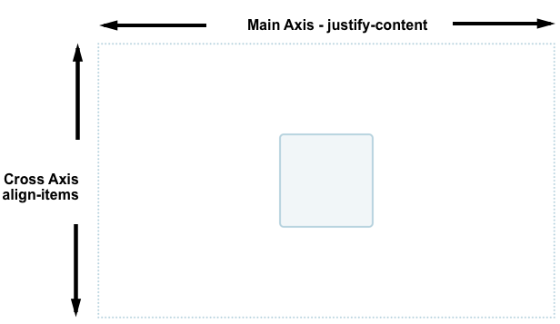
Flexbox 提供了多个属性来控制对齐和间距,其中 align-items 和 justify-content 是实现元素居中的基础。要居中一个元素,我们使用 align-items 属性在交叉轴上对齐项目,在本例中即为垂直方向的块轴。我们使用 justify-content 在主轴上对齐项目,在本例中即为水平方向的行内轴。
在下面的代码示例中,更改容器或嵌套元素的大小。嵌套的元素始终保持居中。
<div class="box">
  <div></div>
</div>
.box {
  display: flex;
  align-items: center;
  justify-content: center;
  border: 2px dotted rgb(96 139 168);
}

.box div {
  width: 100px;
  height: 100px;
  border: 2px solid rgb(96 139 168);
  border-radius: 5px;
  background-color: rgb(96 139 168 / 0.2);
}
用于控制 Flexbox 中对齐的属性
我们将在本指南中介绍的属性如下:
justify-content:控制所有项目在主轴上的对齐方式。align-items:控制所有项目在交叉轴上的对齐方式。align-self:控制单个弹性项目在交叉轴上的对齐方式。align-content:控制交叉轴上弹性行之间的空间。gap、column-gap和row-gap:用于在弹性项目之间创建间隙或间距。
我们还将探讨如何在 Flexbox 中使用 auto 外边距进行对齐。
在交叉轴上对齐项目
在弹性容器上设置的 align-items 属性,以及在弹性项目上设置的 align-self 属性,控制弹性项目在交叉轴上的对齐方式。如果 flex-direction 为 row,交叉轴沿列向下延伸;如果 flex-direction 为 column,交叉轴沿行延伸。
在这个基础的弹性盒子示例中,我们使用了交叉轴对齐。当我们给一个容器添加 display: flex 时,其子项会变成弹性项目,并排列成一行。默认情况下,它们都会拉伸以匹配最高项目的高度,因为最高的项目定义了交叉轴上项目的高度。如果弹性容器设置了高度,那么无论每个项目中有多少内容,这些项目都会拉伸到该高度。
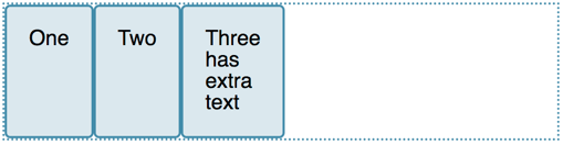
项目变成相同高度的原因是,控制交叉轴对齐的 align-items 属性的初始值为 stretch。
我们可以使用其他值来控制项目的对齐方式:
align-items: stretchalign-items: flex-startalign-items: flex-endalign-items: startalign-items: endalign-items: centeralign-items: baselinealign-items: first baselinealign-items: last baseline
在下面的示例中,align-items 的值为 stretch。尝试其他值,看看项目在弹性容器中是如何相互对齐的。
<div class="box">
  <div>One</div>
  <div>Two</div>
  <div>Three <br />has <br />extra <br />text</div>
</div>
.box {
  border: 2px dotted rgb(96 139 168);
  display: flex;
  align-items: stretch;
}

.box div {
  width: 100px;
  background-color: rgb(96 139 168 / 0.2);
  border: 2px solid rgb(96 139 168);
  border-radius: 5px;
}
使用 align-self 对齐单个项目
align-items 属性将 align-self 属性作为一个组应用于所有弹性项目。这意味着你可以显式声明 align-self 属性来针对单个项目。align-self 属性接受与 align-items 相同的所有值,外加一个 auto 值,它会将该值重置为弹性容器上定义的值。
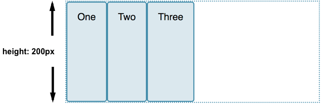
在接下来的实时示例中,弹性容器设置了 align-items: flex-start,这意味着所有项目都对齐到交叉轴的起始位置。使用 first-child 选择器,第一个项目被设置为 align-self: stretch。另一个带有 selected 类的项目设置了 align-self: center。更改 align-items 的值或更改单个项目上 align-self 的值,看看它是如何工作的。
<div class="box">
  <div>One</div>
  <div>Two</div>
  <div class="selected">Three</div>
  <div>Four</div>
</div>
.box {
  border: 2px dotted rgb(96 139 168);
  display: flex;
  align-items: flex-start;
  height: 200px;
}
.box div {
  background-color: rgb(96 139 168 / 0.2);
  border: 2px solid rgb(96 139 168);
  border-radius: 5px;
  padding: 20px;
}
.box > *:first-child {
  align-self: stretch;
}
.box .selected {
  align-self: center;
}
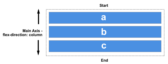
更改主轴
到目前为止,我们已经探讨了在从上到下书写的语言中,当 flex-direction 默认为 row 时的对齐行为,此时主轴是水平的,交叉轴是垂直的。
保持相同的书写模式,当 flex-direction 变为 column 时,align-items 和 align-self 属性将使项目向左和向右对齐,而不是向上和向下;这些属性仍然是在交叉轴上对齐项目,但此时交叉轴是水平的!
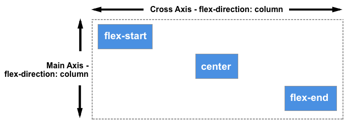
你可以在下面的示例中尝试这一点,该示例的弹性容器设置了 flex-direction: column,但其他方面与前一个示例完全相同。
<div class="box">
  <div>One</div>
  <div>Two</div>
  <div class="selected">Three</div>
  <div>Four</div>
</div>
.box {
  border: 2px dotted rgb(96 139 168);
  display: flex;
  flex-direction: column;
  align-items: flex-start;
  width: 200px;
}
.box div {
  background-color: rgb(96 139 168 / 0.2);
  border: 2px solid rgb(96 139 168);
  border-radius: 5px;
  padding: 20px;
}
.box > *:first-child {
  align-self: stretch;
}
.box .selected {
  align-self: center;
}
使用 align-content 属性在交叉轴上对齐内容
到目前为止,我们一直专注于在由弹性容器定义的区域内对齐单个或多个项目,且这些项目只占一行。当允许弹性项目换行到多行时,可以使用 align-content 属性来控制行与行之间的空间分布,这也被称为堆叠弹性行。
为了让 align-content 生效,弹性容器的交叉轴尺寸(在本例中是高度)必须大于显示项目所需的尺寸。然后它会作用于所有项目作为一个整体。align-content 的值决定了如何处理额外的可用空间,以及整个项目集合在其中的对齐方式。
align-content 属性接受以下值:
align-content: flex-startalign-content: flex-endalign-content: startalign-content: endalign-content: centeralign-content: space-betweenalign-content: space-aroundalign-content: space-evenlyalign-content: stretchalign-content: normal(行为与stretch相同)align-content: baselinealign-content: first baselinealign-content: last baseline
在下面的实时示例中,弹性容器的高度为 400 像素,这比显示我们的项目所需的空间要多。align-content 的值为 space-between,这意味着可用空间被分配在弹性行之间,这些行在交叉轴上与容器的起始和结束边缘齐平。
尝试其他值,看看 align-content 属性是如何工作的。
<div class="box">
  <div>One</div>
  <div>Two</div>
  <div>Three</div>
  <div>Four</div>
  <div>Five</div>
  <div>Six</div>
  <div>Seven</div>
  <div>Eight</div>
</div>
.box {
  width: 450px;
  border: 2px dotted rgb(96 139 168);
  display: flex;
  flex-wrap: wrap;
  height: 300px;
  align-content: space-between;
}

.box > * {
  padding: 20px;
  border: 2px solid rgb(96 139 168);
  border-radius: 5px;
  background-color: rgb(96 139 168 / 0.2);
  flex: 1 1 100px;
}

.box div {
  background-color: rgb(96 139 168 / 0.2);
  border: 2px solid rgb(96 139 168);
  border-radius: 5px;
  padding: 20px;
}
我们可以再次将 flex-direction 切换为 column,以观察当按列工作时该属性的行为。和之前一样,我们需要在交叉轴上有足够的空间,以便在显示完所有项目后还有一些可用空间。
<div class="box">
  <div>One</div>
  <div>Two</div>
  <div>Three</div>
  <div>Four</div>
  <div>Five</div>
  <div>Six</div>
  <div>Seven</div>
  <div>Eight</div>
</div>
.box {
  display: flex;
  flex-wrap: wrap;
  flex-direction: column;
  width: 400px;
  height: 300px;
  align-content: space-between;
  border: 2px dotted rgb(96 139 168);
}

.box > * {
  padding: 20px;
  border: 2px solid rgb(96 139 168);
  border-radius: 5px;
  background-color: rgb(96 139 168 / 0.2);
  flex: 1 1 100px;
}

.box div {
  background-color: rgb(96 139 168 / 0.2);
  border: 2px solid rgb(96 139 168);
  border-radius: 5px;
  padding: 20px;
}
在主轴上对齐内容
现在我们已经了解了对齐在交叉轴上的工作方式,我们可以看看主轴。在这里,我们只有一个可用的属性——justify-content。这是因为在主轴上,我们只将项目作为一个组来处理。通过 justify-content,我们可以控制当有多余空间时如何处理这些空间。
在我们最初的 display: flex 示例中,项目以行的形式显示,并全部在容器的起始位置对齐。这是因为 justify-content 的初始值为 normal,其行为与 start 相同。任何可用的空间都会被放置在项目的末尾。
baseline 值在这个维度上不适用。除此之外,justify-content 属性接受与 align-content 相同的值。
justify-content: flex-startjustify-content: flex-endjustify-content: startjustify-content: endjustify-content: leftjustify-content: rightjustify-content: centerjustify-content: space-betweenjustify-content: space-aroundjustify-content: space-evenlyjustify-content: stretch(行为与 start 相同)justify-content: normal(行为与 stretch 相同,而 stretch 的行为又与 start 相同)
在下面的示例中,justify-content 的值为 space-between。显示完项目后,剩余的可用空间被分配在项目之间。最左和最右的项目与容器的起始和结束边缘齐平。
<div class="box">
  <div>One</div>
  <div>Two</div>
  <div>Three</div>
  <div>Four</div>
</div>
.box {
  display: flex;
  justify-content: space-between;
  border: 2px dotted rgb(96 139 168);
}

.box > * {
  padding: 20px;
  border: 2px solid rgb(96 139 168);
  border-radius: 5px;
  background-color: rgb(96 139 168 / 0.2);
}
如果因为 flex-direction 设置为 column 而使主轴处于块方向,那么只要弹性容器中有可分配的空间,justify-content 就会在该维度上分配项目之间的空间。
<div class="box">
  <div>One</div>
  <div>Two</div>
  <div>Three</div>
  <div>Four</div>
</div>
.box {
  display: flex;
  flex-direction: column;
  justify-content: space-between;
  height: 300px;
  border: 2px dotted rgb(96 139 168);
}

.box > * {
  padding: 20px;
  border: 2px solid rgb(96 139 168);
  border-radius: 5px;
  background-color: rgb(96 139 168 / 0.2);
}
对齐与书写模式
请记住,对于所有这些对齐方法,start 和 end 的值都与书写模式相关。如果 justify-content 的值为 start,且书写模式是从左到右(如英语),项目将从容器的左侧开始对齐。
然而,如果书写模式是从右到左(如阿拉伯语),项目将从容器的右侧开始对齐。
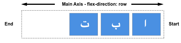
下面的实时示例将 direction 属性设置为 rtl,以强制我们的项目采用从右到左的流向。你可以移除这个设置,或更改 justify-content 的值,以观察当行内方向的起始点在右侧时 Flexbox 的行为。
<div class="box">
  <div>One</div>
  <div>Two</div>
  <div>Three</div>
  <div>Four</div>
</div>
.box {
  direction: rtl;
  display: flex;
  justify-content: flex-end;
  border: 2px dotted rgb(96 139 168);
}

.box > * {
  padding: 20px;
  border: 2px solid rgb(96 139 168);
  border-radius: 5px;
  background-color: rgb(96 139 168 / 0.2);
}
对齐与 flex-direction
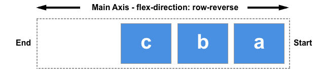
如果你改变 flex-direction 属性,例如使用 row-reverse 而不是 row,行的 start 方向也会改变。
在下一个示例中,flex-direction: row-reverse 和 justify-content: flex-end 定义了弹性容器内项目的方向和位置。在从左到右的语言中,项目在左侧对齐。尝试将 flex-direction: row-reverse 改为 flex-direction: row。你会看到项目现在移动到了右侧,并且项目的视觉顺序也反转了。
<div class="box">
  <div>One</div>
  <div>Two</div>
  <div>Three</div>
  <div>Four</div>
</div>
.box {
  display: flex;
  flex-direction: row-reverse;
  justify-content: flex-end;
  border: 2px dotted rgb(96 139 168);
}

.box > * {
  padding: 20px;
  border: 2px solid rgb(96 139 168);
  border-radius: 5px;
  background-color: rgb(96 139 168 / 0.2);
}
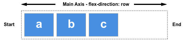
虽然这一切可能看起来有点令人困惑,但要记住的规则是,除非你做些什么来改变它,否则弹性项目会按照文档语言中单词沿行内(row)轴的排列方向来布局。start 和 flex-start 将位于文本句子的起始位置。

你可以通过选择 flex-direction: column 将它们切换为文档语言的块方向显示。然后,start 和 flex-start 将位于第一个文本段落的顶部。
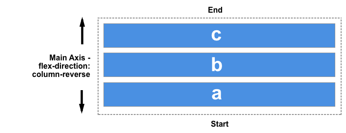
如果你将 flex-direction 改为某个反向值,它们将从末端轴开始布局,并且顺序与文档语言中单词的书写方式相反。然后,start 和 flex-start 会改变到该轴的末端——也就是,如果按行工作,行会换行的位置;或者在块方向上,最后一个文本段落的末尾。
使用 auto 外边距实现主轴对齐
在主轴上,我们没有 justify-items 或 justify-self 属性可用,因为我们的项目在该轴上被视为一个组。然而,通过结合使用 auto 外边距和 Flexbox,可以实现一些单独的对齐,以便将一个项目或一组项目与其他项目分开。
一个常见的模式是导航栏,其中一些关键项目对齐到右侧,而主要组在左侧。你可能会认为这应该是 justify-self 属性的用例。然而,请考虑下图。举个例子,看下面这张图,一边有三个项目,另一边有两个。如果 justify-self 作用于弹性项目并设置在项目 d 上,它也会改变其后项目 e 的对齐方式,这可能不是我们想要的。
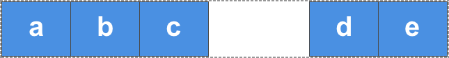
相反,可以通过 CSS 外边距将项目 d 推到另一边。
在这个实时示例中,通过将第四个项目的 margin-left 设置为 auto,使其与前三个项目分开。auto 会在其轴向上占据所有可用空间。这与使用 margin 的 auto 左右外边距来居中一个块的原理相同。每一边都试图占据尽可能多的空间,从而将块推到中间。
在这个实时示例中,弹性项目使用基本的 flex 值排列成一行,并且在第四个项目上设置的 push 类应用了 margin-left: auto。尝试移除第四个项目上的类,或将该类添加到不同的项目上,看看它是如何工作的。
<div class="box">
  <div>One</div>
  <div>Two</div>
  <div>Three</div>
  <div class="push">Four</div>
  <div>Five</div>
</div>
.box {
  display: flex;
  border: 2px dotted rgb(96 139 168);
}

.box > * {
  padding: 20px;
  border: 2px solid rgb(96 139 168);
  border-radius: 5px;
  background-color: rgb(96 139 168 / 0.2);
}
.push {
  margin-left: auto;
}
在项目之间创建间距
要在弹性项目之间创建间隙,请使用 gap、column-gap 和 row-gap 属性。column-gap 属性在一行中的项目之间创建间隙。row-gap 属性在设置了 flex-wrap 为 wrap 时,在弹性行之间创建间隙。
gap 属性是设置 row-gap 和 column-gap 的简写。弹性项目或弹性行之间的间隙取决于方向。如果 flex-direction 属性创建了行,则第一个值定义弹性行之间的间隙,第二个值定义每行内项目之间的间隙。对于列(当 flex-direction 设置为 column 或 column-reverse 时),第一个值定义弹性项目之间的间隙,第二个值定义弹性行之间的间隙。
<div class="box">
  <div>One</div>
  <div>Two</div>
  <div>Three</div>
  <div>Four</div>
  <div>Five</div>
  <div>Six</div>
</div>
.box {
  display: flex;
  flex-wrap: wrap;
  row-gap: 10px;
  column-gap: 2em;
  border: 2px dotted rgb(96 139 168);
}

.box > * {
  flex: 1;
  padding: 20px;
  border: 2px solid rgb(96 139 168);
  border-radius: 5px;
  background-color: rgb(96 139 168 / 0.2);
}